Module 2: Basic Survey Design
- Identify and implement basic principles of online programming and survey design with respect to the user experience
- Identify the strengths and weaknesses of running experiments with and coding within Qualtrics
- Apply programming logic within Qualtrics by creating basic and advanced surveys
This module will focus on basic survey design as this pertains to online programming. A number of issues arise when it comes to the layout of a survey, hosting a survey, choosing the type of question that would best address your question, and more. For example, because we are discussing surveys on the Web, some things you might want to consider are how web surveys are self-administered, computerized, interactive, distributed, and rich, visual tools. In Module 1, we discussed, for instance, how you ought to run your instructions by other nonexperts to ensure that they can be understood by most: this is merely one consequence of self-administering web surveys and often their anonymous distribution as well.
There are many differences between how someone experiences a survey in person vs. online. Online, participants use different browsers (Chrome vs. Firefox vs. Internet Explorer, etc.), have different versions of browsers (Chrome version 87 vs. version 86), have different operating systems (Windows 10 versus Mac OS), have different screen resolutions (1024 x 768 vs. 800 x 600), have differently sized browser windows (i.e., not full-screen), have different connection types and speeds, and have different settings (background color, font size, the way each browser renders a particular font, security settings, etc.). This is not to mention issues that arise from particular scripts: that is, certain code works better for different browsers, and some browsers have default security settings that make scripts designed for interacting with the browsers not as useful. People also use different devices to interact with the internet: their keyboard, mouse, or touching via their mobile phone, etc. Some of these issues would take a different form if administering the survey in person, but for us, this means we have to particularly be aware of the User Experience (UX). We have to try to understand how our participants interact with the survey in order to properly assess our constructs and questions of interest. For example, take a look at the display below:
Show me worse UX than this: pic.twitter.com/btJEbS72Kf
— I Am Devloper (@iamdevloper) December 11, 2020
The point here is that this is confusing to you as a user: what does each option do? Does declining result in ending your current call? Or are you declining the call that's coming in? Why does the same icon refer to completely different actions? If you click on that thread, you'll find numerous other examples of this: for example, the fire TV remote, the Apple mouse charger, error prompts, user icons, more phone call icons, etc. Why does this matter? Well, if you're a social scientist studying people, you need to make sure that people can actually understand what you're asking them. That means good survey design.
Of note, while we will discuss good design principles, you will have to balance this against your need to a) actually measure the construct or question you're interested in and b) the user experience. Design should be both aesthetically pleasing and functional. For example, see what the psychologists below point out about Google's newly redesigned icons:
When Google changes feature search to conjunction search... pic.twitter.com/GZKL6eGRwH
— Icelandic Vision Lab (@IceVisLab) November 9, 2020
Sure, these Google icons involve all the Google brand colors, which could arguably help the company reinforce the brand's design principles, but what made the icons really "easy" to spot in the past was that each had both a unique shape and color pattern. They stood out. You could immediately tell the difference between the calendar and gmail icon. With the colors all together like this, that makes spotting the difference a lot harder. It makes understanding how the function of each differs a little harder.
In this module, we will thus be discussing how to design, host, and distribute surveys that will hopefully be more intuitive for your users (participants). We here assume that you've already got your well-worded questions and well-crafted response options: that is a part of research methods and beyond the scope of this course. Here, we'll view survey design through the lens of user experience.
If you are looking for additional resources on research methods, you could read this chapter, which addresses questions about e.g., how many points should go on a scale question, how many labels should be used for scale questions, etc. A lot of the survey design lessons were also based on the textbook, Couper (2008).
Principles of Online Programming
Given the fact that the online experience is so different from the in person experience, there are some basic principles that researchers should follow if they want their research to replicate and stand on its own. For one, researchers must ensure that their work is publically available - in the state that it was run - so that other researchers can experience the survey or experiment for themselves. Researchers must also consider what their participants experience when they're doing their survey/experiment, and an online survey/experiment also requires a stable way to host the survey or experiment so that participants can actually answer your questions. We will consider these in more detail below.
The importance of version control
Version control refers to a management system for handling different forms of information. Any time a particular document is modified, revised, or changed, it is marked: whether by creating a new file or merging the same file. For example, academics will often use version control with respect to a manuscript. You might name a document projectname_resultsmethods_v1.docx, indicating the first version of your Results and Methods draft for said project, and then when someone revises or comments on the manuscript, they'll append their initials so the new saved document says _v1_CB and so on. As a Duke student, you may have been encouraged to use Box. When you do, if you upload the same file to the same path/area, Box will save the file under its current name but indicate that the file is now v2, showing that it had already been uploaded previously (and allowing you to access the original version of that old file).
With respect to code and surveys, developers will particularly use version control to help maintain documentation and control over source code. That is, each time the code changes substantially, they will want to upload or make a "commit" or revision to the code on an online repository (such as Github) so that they essentially have notes as to what has changed.
What exactly version control looks like will depend on what platform is being used for your survey or experiment. For example, if you're using a survey platform such as Qualtrics instead of hard-coding your questionnaire, version control might look like copying your survey whenever you make major changes and renaming the new project, indicating to yourself what revisions were made. You might even post the survey file or a PDF of the survey file to an open repository - either one private just for yourself or public for other researchers to see - so that you can refer back to what your methods looked like as you continued developing the project or when your participants actually saw the survey. This is particularly helpful given that survey platforms will often autosave your survey if you make a single change, and you may not necessarily want every change you've made to be realized in the final version. I really cannot emphasize this more, even if version control is not typically talked of with respect to surveys on standard survey platforms. I've had a few surveys with other collaborators, and any time multiple people are working on any project could lead to a number of issues. Combined with the defauls that are in some of these survey platforms, this made for ripe scenarios where we've had typos, unsaved edits (e.g., both of us working on the survey at the same time and then the platform not saving the edit), and edits that were saved but that impacted other parts of the survey and which we thought were okay. If we had been more vigilant with our version control, we may have been able to catch such errors. The same happens even when you're the only one working on the survey - you will miss things, but one of the ways to try to combat this is to document your changes as you go along. If you hardcoded your questionnaire, you would definitely want to post your code to a repository, as it would help save (store) your (currently functioning) code in case you change lines and the codes stops working (i.e., version control in this case helps you make proper revisions).
To give an example, you can find the version control for this Github repository here (specifically Module 2). Notably, none of these edits are all that good in terms of version control: I should've written what actually changed as a note each time that I uploaded a new version of the website file. Even still, you can see what Github indicates is new for the file when you click on a particular update. You can see when I added new content or when I changed the layout. Because this is Module 2, by the time I was filling out most of the edits, I was primarily focused on changing the content, but if you looked up Module 1 or the Index page, the version control would look very different.
Because you'll be coding your survey or experiment for an online population, it is especially important to use version control not just for your own sake, but also for your colleagues who may want to replicate your work or use a scale measure or see how exactly you assessed a particular construct. Whether you're coding the survey or experiment yourself or using a survey platform or other aide, you should *always* include some version control system in your research plans.
Design or code with user experience in mind
As discussed above, one of the most important things is to ascertain whether your participants actually understand what you are asking. You need to prioritize the user experience in your survey design and your code as well.
That will look different depending on your particular plans. What measurements do you need in your experiment or survey? How can you reduce the burden of retrieving the output, and how can you ensure your output is an accurate reflection of what your participant meant while doing your study? How can you make things as easy as possible for the participants who are doing your task?
I will give one brief example of the ways in which user experience can define the constructs we're studying. In developmental psychology, many of the same tasks that are used with older populations are gamified so that children will be able to do the task in question. If they were not gamified, the tasks would be too boring, and the children participants would presumably stop paying attention, which would suggest that the construct being studied may not be what you think it is. Outside of developmental psychology, you can see another study that explicitly takes a UX approach to how its psychological intervention is designed. Here the authors edited a "growth mindset" intervention; mindset refers to individual beliefs about whether intelligence - as a trait - is inherent and fixed (i.e., fixed minset) or malleabe and can be grown through effort and experience (growth mindset). Educational research has largely suggested that adopting a growth mindset is beneficial for students. The authors recognized that iteratively improving a particular lesson (or in this case, intervention) by evaluating participant responses with respect to the lesson goals was important for maximal impact. Moreover, they could make sure that these responses actually reflected what they thought participant responses would look like.
Here, I'm not necessarily suggesting that you have to completely change your task - oh, go gamify everything! However, as stated in Module 1, it's important to have people test out your survey or experiment before you run your study in earnest. It's important that not just be people in your lab, because things that seem normal to you (or other people who know your work) may not seem that way to your participants (unless you want only expert responses). You can check how comprehensible your survey or experiment are by running a usability test or observe participants doing your study in their natural habitat (like with their own computer; see ethnographic observations). Whatever your wording or question or design, it will not be perfect on the first try, and continually checking in with your potential population will help you make sure that you are studying what you think you are.
On my own end, I have a paper that I published where I claim that people weren't aware of a manipulation we included to make one part of the study harder than the other. Recently, with another project within the same domain, I ran a usability test with similar question wording, and one problem that arose was that participants didn't entirely understand what the question was asking. In other words, what I had previously assumed meant was a lack of awareness might in fact reflect noise in my measurement tools. If you use an iterative research process, you will be able to improve your survey design until you get something closer to what you hope to measure.
Hosting your experiment online
The last and final principle of onling programming that I want to discuss in this subsection relates to the online nature. If an online survey or experiment, then you're responsible for ensuring that everyone can actually access the study. In fact, this actually connects back to our Diversity & Inclusion consideration from Module 1: although we've been going over principles of online programming, inherently by having an online study, we are excluding parts of the population: likely for social scientists, not everyone in the target population will have access to the Internet, and not everyone who has Internet access may have the same knowledge of how to use the Internet (my dad barely knows how to use email, for example). As you can imagine, this can result in serious UX issues and generalization issues as well as serious hosting issues.
Let me give an example of a study I was consulting on and how hosting can become an issue. We were trying to evaluate how good a particular product was, and the survey I had was hosted in a famous survey platform, with a link to the product so participants could experience the product and then return to the survey to answer questions about it. This study was run with an online panel. Now, you might already anticipate what the user experience issue is here: people do not like going to another site while they're in a survey. They don't like signing up for things - even if you give them all the login information they need - and they don't want to remember other things like passwords when they were set to just answer questions. We were also assuming something specific about our population: that they would understand how to return to the survey and were broadly Internet literate (which actually wasn't the biggest issue). We hit a snag: we needed people to actually use the product being evaluated (instead of stopping/dropping out the survey), we needed a large number of people to do the survey (within our timeframe, we couldn't just invite all these people to look at the product in person), and we needed to probe their understanding of how the product worked and whether the product essentially did its job. So, in addition to the user experience issue, there was also a hosting issue: that is, the survey host was distinct from where the product was being hosted, and this caused drop-out from survey participants. All of these online programming principles can indeed interact like this to create additional considerations for you as a researcher.
In this particular course and module, one way that we will solve survey design issues is to use a survey platform called Qualtrics. (If your institution does not have Qualtrics, consider alternatives; for Duke students, this is at duke.qualtrics.com). You can get somewhat around the issue of hosting if you're using a survey platform (though, see above example), since the survey platform will take care of hosting (and linking to the survey) for you. (Similarly, our next subsection will go over survey design considerations, which the creators of, or upkeep team for, these survey platforms usually have considered).
If you don't want to use a survey platform but want to hardcode your survey or experiment, you can, but you will now definitely have to consider where to host the survey. If you want a free option, you can host your survey on Github, much in the same way that this site is hosted here on Github via Github pages. Github pages has a tutorial on how to set up your website so that you can host a survey. To give an example, let's look at our site's repository! Because our site is already publically hosted via the Github pages interface, we could now upload a file in this repository and send anyone in the world the link to socsciprogramming.github.io/FILENAME. Now, if you're hardcoding, you'd want your file to be dynamic and record data, but we'll go over that part in Module 3. The point here is that this site takes advantage of Microsoft's resources via Github Pages so that I could send this link to any participant (potentially excluding some countries) and not worry about whether there would be an access problem.
Finally, if you're a Duke student, you can actually use what's known as your personal CIFS (Common Internet File System) home directory. Duke has created a tutorial for accessing this from Windows and Mac. If you're trying to access this directory outside of Duke (i.e., not connected to the Duke network), you'll need to login via the Duke VPN (Virtual Private Network - see links for details). If you're not a Duke student but are a student elsewhere, it is likely that your university has a version of this. Here's what it looks like when you are connected:
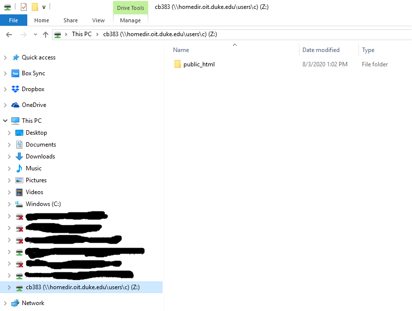
And then you can access whatever files you're hosting in that public_html folder by going to https://people.duke.edu/~YOURNETID/FILENAME. If you've put your file in a folder within the public_html folder, you'd put FOLDERNAME/FILENAME after the net id portion. For example, you can see my CIFS site here. Mine is blank because of the file that I have in the public_html folder. You can see my RA's site here, including the experiment he coded for Duke undergraduates. Which should you use? Well, I like using Duke's CIFS for tasks because I trust Duke OIT to keep the server going for its researchers, whereas I know a lot less about Microsoft's priorities and scheduled Github repairs, etc. But it's your personal choice!
If you want to see more Github Pages repositories, you can check out: John Pearson's lab, Peter Whitehead's personal Github, Kevin O'Neill's personal Github, etc. Probably the most helpful is looking at expfactory, which is a repository full of other hardcoded tasks (and we will return to this later).
Additional reading: This site goes over other options for hosting your experiments and/or a webpage.
Please remember to evaluate the subsection with the Google Form below so this can be improved in the future (you can find the results from the Google Form here).
Basic Survey Design
Considering survey design is important for several reasons. A well-designed survey makes the task easier for participants; participants can focus on your questions more than the process of taking the survey (e.g., clicking through to another link, inputting information, where do I go next, etc.). A well-designed survey also may motivate participants to complete the survey, because it's either more aesthetically pleasing or generally requires less effort (i.e., you've made the task easier). Finally, a well-designed survey will also make your survey seem more important and legimitate, all of which should improve data quality. Let's look at an example where survey design completely changes the "story" the data tell you:
Based on these survey data (from today's @WSJ), would you say that people in the US are more or less willing than people in China and Japan to take a Covid-19 vaccine? My answer below. (1/N) pic.twitter.com/LyovdAcPFx
— Martin West (@ProfMartyWest) December 8, 2020
As Professor Martin West points out in this thread, if you look at these bar charts, you might think that the U.S. has a higher proportion of people who would take a COVID-19 vaccine than China. However, this is not the full story. Research suggests that there are cultural differences in how people perceive certain response options, with folks from East Asian cultures, for example, being less likely to endorse "strongly" agree or disagree (the extreme ends of the scale). If you collapse across strongly and somewhat agree, you'd find that China has a higher of proportion of participants who endorse the vaccine than the U.S. As the Professor reveals in the thread, too, another question in the same survey has a more objective framework - how long would you wait before getting the vaccine - and folks in China endorse waiting less time than folks in the U.S. In short, both the question itself and the response options were biased in subtle ways that changed what we might conclude.
The point here isn't the story about vaccines, but rather how survey design can impact both how you interpret your data and the story you can tell with your data. This is where user experience (online programming principle) really comes in: in designing surveys, it will be useful to consider all the ways that participants will want to answer your question. We will go over a number of survey design topics, ranging from layout to response options to distribtuion and more.
Design 1: Survey Layout
Perhaps at the "highest" level of survey design is the distinction between scrolling vs. paging designs. What do I mean by that? Well, first, we have to talk about the difference between screens, pages, and forms. A page can be the size of one or many screens, and the screen itself is outside the scope of the code governing a webpage - that is more related to your own hardware for interacting with the internet. A form is a type of page with interactive components that allow you to submit information (e.g., demographics, your name, etc.) and then have code that will process the submitted information for later use. You can thus have a single-form, a single-page survey, or a single-question-per-form survey. The single-form and single-page surveys have 1 button to submit your responses, while a single-question-per-form survey has one for each question. Knowing that you can have multiple forms or multiple questions per form means that you have a lot of design options for a survey.
This particular website has a "scrolling design." On the Module, at all times, you can skip and browse between parts of the site and go back to previous parts as well. The information is contained on a single page (form if I had an action item -- if this was a survey, it would have an action button (e.g., submit) at the very end of the Module). If I had questions, you would be able to answer the questions in any order, you could change your answers at any point, and you could answer however many you wanted before submitting. And, here, with respect to the internet, your participant will have loaded the entire survey - or this webpage - all at the very beginning, meaning that if there are errors, it would likely occur at the beginning and once the user interacted with the survey by choosing an action (pressing the submit button or choosing a particular answer). Each action could lead to its own error, but because so much is loaded up front, most of the interactivity-related errors should occur earlier. With this interface and the ability to answer questions at will, this design is probably most like an in-person paper survey.
Here are some advantages of a scrolling design:
- If you really want to mimic a paper survey and fear differences between online versus in person administration, this might be your jam.
- Because participants can scroll through the entire survey (and Module here), they have an idea of how long the survey is. They can even use a heuristic to judge, i.e., looking at the scroll bar and saying "wow, this girl has SO much text, huh?!"
- Allowing participants to answer questions in their preferred order, scroll through and browse the survey, change their answers, and skip questions prioritizes their preferences in the survey experience.
- For you as the researcher, this is about as easy as it can get. You're not making the design or code complicated: e.g., you have no skipping or programming logic, etc. This may result in fewer technical errors or even issues with participants using different browsers to access your survey.
- With perhaps less interactivity - the survey having been loaded all at once - this may mean it loads more quickly overall than another survey that doesn't have this design.
- Since there's also only one submit button in these prototypical scrolling designs, that also means potentially fewer data submission errors.
Here are some disadvantages of a scrolling design:
- You usually have to complete the survey all at once.
- Your data could be lost if your participant forgets to press that crucial submit button at the end.
- Being able to see all the survey questions at once could be bad too, with participants selectively responding to questions in a strategic way to get through the survey as fast as possible. That may happen with any survey, but this case isn't just participant error; it's also responding based on knowledge of what the set of next questions may look like if you respond in a certain way.
- Participants are in charge of the survey flow, which means that they'll make errors or omission or commission (incorrect or additional actions; failing to perform a certain action). In other words, e.g., they might not be deliberately skipping questions; they could've just scrolled past a question.
- Depending on your particular code, some of the nice interactive components - like feedback to a participant on how far they are in the survey - cannot be provided.
- If you care about the order in which participants respond, you can't control that here. You might care, for example, if one of your questions was meant to "prime" or give context to the next question.
- This isn't particularly friendly for people who have worse dexterity or hand-eye coordination.
If all that's the case, why did I choose a scrolling design for this site? Well, it seemed highly likely to me that folks would enter this tutorial site with differing levels of knowledge, and it would be best to let people skip around. They may also want to see what is covered in the course before deciding whether looking through this material is worth their time. I thought these outweighed any potential disadvantages of a scrolling design for a webpage -- which has slightly different considerations than for a survey.
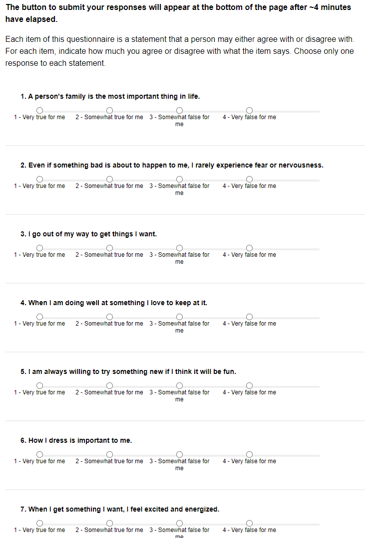
Above is an example of a "scrolling" design for part of one questionnaire (the BIS-BAS, Carver & White, 1994) on a specific topic. This particular survey was a sort of "combination," with each questionnaire formatted in a scrolling design but the survey itself comprised of multiple questionnaires.
What's the alternative to a scrolling design? At the other end of design, you could have a paging survey design, whereby the survey "is chunked into several sets of ... forms, each of which contains one or more questions" (Couper, 2008). Here, you could have a single question per form or multiple questions per form, and at the end of each form, there is a submit or next button for participants to press.
Here are some advantages of a paging survey design:
- Not much need to scroll in the survey.
- You can usually retain data from a partially completed the survey, and you don't need to complete the survey in a single session.
- You can add in more logic to automate skipping from certain parts of the survey to others.
- You can give participants feedback on missing data, implausible responses or ones that don't match what the question asks (e.g., # of days and then they submit words, not a #), etc.
- You can also provide live feedback to motivate participants to continue or engage them in the survey, without it adding to some long text in the middle of the scrolling design.
Here are some disadvantages of a paging survey design:
- By nature, you're including more submit/next buttons and more interactivity with the code/program, so the survey might take longer to finish and actually submitting the data could be more difficult (parsing together from several timepoints).
- Participants don't typically know where exactly they are in the survey or have a good sense of how far they are in.
- Participants don't have the same level of control over which questions they want to fill out first. You'll have to make the decision whether to include a "back" button within the survey, and even if you did, it might be hard for a participant to pick through things as they might in a scrolling design.
- You're allowing for more interactivity and customization within the survey, which is more work for you and more difficult programming-wise.
- If you don't include a back button, you run into some of the ethical questions we asked of MTurk in Module 1: what if participants wanted to not consent midway through the survey? Maybe once they've gone through more of the questions, they don't really want to consent to participate anymore. If the questions are on separate pages, it's harder to know upfront what to expect (from the perspective of the participant).
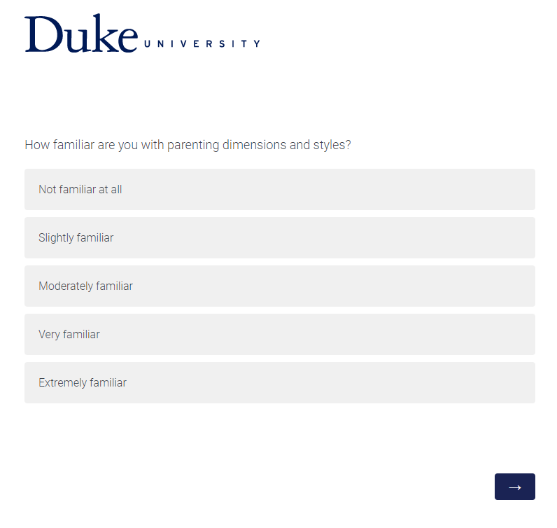
Above is an example of a paging survey design with 1 question per form. It forces the participant to consider that particular item, but does not let the participant see what the others might be even within the same questionnaire.
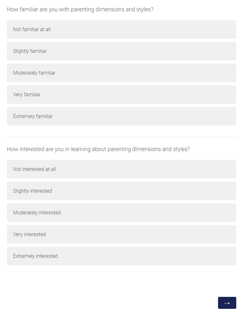
Above is an example of a paging survey design with 2 questions per form. In this case, you can see how having multiple questions in the same form could pose an issue if you think that the second question will influence how the participants answer the first, and the order in which participants answer questions is important to you. For example, in this case, I would want participants to answer how familiar they are with particular material (baseline knowledge) before they tell me how interested they are in that material; it's possible with both on the screen, the participant realizes they're about to be asked questions about that topic and then overestimate their familiarity (dampening its potential for a baseline measure).
There are many combinations of these kinds of designs. For instance, it's generally good practice to chunk together related items in a survey (like if you're going to give students exam-related questions, ask them in 1 section instead of randomly interspersing the questions in the survey) and to break the survey up whenever you think there's just too much for the code to do or internet browser to process.
Couper (2008) summarizes some research on the difference between these two designs, namely that when participants need to look up information and complete a survey, they were slower to complete a scrolling survey, but they were slowest when they were answering specific questions based on the information they looked up with the paging design. Some key differences may arise less from these two specific designs than the complexity and length of the survey and what exactly participants are expected to do. What is most appropriate for your study will depend on what you expect of your participants. There are also other "general" types of design layouts (e.g., tabbed/user-navigated/menu-driven surveys), but these two are a good "general" introduction to thinking about survey layout broadly.
Generally, Couper (2008) suggests the following recommendations:
You may want to use a scrolling design when 1) the survey is relatively short; 2) you want everyone to answer all the questions (no skip logic); 3) you aren't worrying about missing data; 4) you may want participants to review their answers to earlier questions; 5) you don't care about the order in which participants complete the questions; 6) you want to make sure the survey is similar to in-person administered surveys; or 7) for some reason, you need to print the questionnaire and have a copy of it stored somewhere.
You may want to use a paging survey design when 1) the survey is long; 2) you include questions that have skip logic (e.g., if participants answers X, no need to show Q2), randomization, and other cutomization; 3) your survey has a lot of graphics (needs a lot of "loading" time); 4) you care about the order in which participants answer questions; or 5) you want to pre-screen participants (if scrolling design, participants might guess what you're looking for since they can see all the questions).
Of note, as I said earlier, a lot of folks use a sort of "mix" between these two options. For example, it looks like Qualtrics will be adding a new question type that allows a combination of these two designs:
Qualtrics now has this amazing matrix form called "Carousel View". Now participants can focus on a single item at a time.
— Sa-kiera T. J. Hudson, PhD 😁😁 (@Sakiera_Hudson) December 12, 2020
When participants answer, it even auto advances them (they can go back to change an answer if they want to)!
I'm excited to try it out! pic.twitter.com/f2HrLrDvL9
Here, we're seeing a paging-focused design (focus on 1 question) that also seems to show all the questions like a scrolling design, but within the framework of a slideshow (assuming you can see all the questions by clicking the arrows). Moreover, this is a much cleaner version of focusing on one particular survey item within a questionnaire than the previous examples I showed above (i.e., the emphasis on the question is clear relative to the response options). If you're at Duke, I don't currently see this option within Qualtrics--but we will discuss our particular use of Qualtrics in subsection 3 of this Module.
Design 2: Input & Response Options
How can response options impact your survey? It depends on what you want to measure with your question. And from a design perspective, the particular way you've formatted responses have their own advantages and disadvantages.
First up, we have radio buttons. Here's an example:
Please select your student status:
Those little circles are the radio buttons! Student status is not a great question, but you can see what radio buttons look like--and indeed you can see what these look like when you use specialized design to style their appearance. Remember this?
Each one of those options is a radio button, but the survey platform, Qualtrics, has made the radio button into something more like an elogated button or filled cell of a table (think Microsoft Word). That gets into the features of radio buttons: 1) they are mutually exclusive (you can only choose one and thus are dependent); 2) once you've selected a single radio button in the set, you cannot unselect it; you can only select another radio button; 3) radio buttons usually can't be resized (but as noted via the Qualtrics example, can instead be styled differently once they're shown to participants). Okay, so what are the advantages or disadvantages of these buttons for survey design?
Here are some advantages of radio buttons:
- They work on all browsers.
- Most people have seen radio buttons and know what to do with them.
- They're simple to code in survey platforms or hard-coding wise.
- If you're testing people on their knowledge or forcing them to have an opinion, you're forcing them to a single choice, which could be useful.
Here are some disadvantages of radio buttons:
- The actual radio button is pretty small to click and can't be resized. Qualtrics isn't changing the radio button itself in the above example - although that questionnaire shows radio buttons when you design the survey, it explicitly changes the presentation of the button to participants because of this strong disadvantage to the user experience re: clicking the small field.
- You can't unselect a radio button, so you can't change your mind later and decide that you don't want to answer the question.
OK, so what are some solutions to these issues, especially unselecting the radio button? Well, you can have a preselected "null" response as the default for the radio button (like "Select student status"), but then you might get people just keeping that option (like the status quo/default option) and/or leaving the question unanswered. You might also include a "choose not to answer" response, but the issue is the same in terms of a default status-quo like behavior. You could include a clear or reset button so that the radio button becomes unselected, but this only works when you've got a paging design. Along that line: you could let participants go "back" or advance in the screen as a way of resetting the page, but again that usually only works with the paging design. Finally, you can also use a "check box" instead of a radio button if you want to let participants uncheck responses.
What about checkboxes? Well, each checkbox operates independently so you can choose multiple boxes at once, which means they're good for the "choose all that apply" questions. This is now a common feature of a "race" question on the U.S. Censure, for instance.
I identify my race/ethnicity as (select all that apply):
Dealing with mutually exclusive options (e.g., "none of the above" and one of the options above) doesn't work with checkboxes, and it's hard to explicitly restrict the number of options that people do in fact select. Sometimes people replace checkboxes with dropboxes (select lists, select fields, pulldown menus).
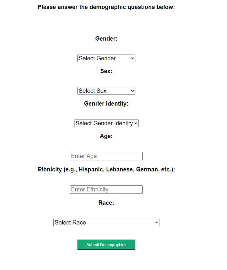
Above is an example of a dropdown box for demographics questions instead of a checkbox. Instead of having participants choose multiple boxes to indicate multiracial, one of the dropdown options is Multiracial. The dropdown has a default cue here for most of the questions: "Select Gender" or "Select Gender Identity" or "Select Sex" or "Select Race". What does this mean? 1) The items that are in that drop-down must be anticipated by the researcher; if it's not there, it can't be chosen by the participant, so the dropdown is most useful when the responses are meant to be closed. 2) You can customize a dropdown to involve scrolling or clicking or searching; there's not just one way to interact with a dropdown menu. In fact, the dropdown menu on my website is triggered when people hover over menu item, which highlights this feature: its user experience can vary extensively. 3) You need participants to select an option in order for data to be recorded, and that's why this example has a "Select" cue to participants. 4) You can also customize dropdowns so that you show a certain number of the response items. In the example above, it's cued to show only 1, which means participants sort of have to guess what the other options will be. This becomes more of an issue if you have A LOT of options in that dropdown. 5) People can also select multiple options from a dropdown. For example, when I'm submitting an article for publication, the journal interface will usually ask what topics the article fits under, and it generally can accept many from the dropdown.
You might want to use these guidelines for dropboxes:
- If your list is too long to display on the page, the answers are known quantities to the participants, your responses can be meaningfully organized, and selecting the response is easier than typing it, then you could use a dropdown. For example, with regard to "gender" in the above example, people could spell Female, female, FEMALE, feMALE, femalE, F, etc. in an input box, causing a headache for analysis, but one can argue that having participants type out their gender is more meaningful, because some people may not identify with your prespecified response options in that dropdown.
- As noted in the example above, put a "Select one" instruction cue; this will help prevent participants from just going along with whatever the first option is.
- You should probably avoid multiple selections in drop boxes; it's annoying from a UX perspective. Every time I submit a scientific manuscript to a journal website, I have to scroll down through all the options to see if they've subsectioned the research topic into separate categories and select the multiple options, if required. No one does it the same.
OK, so if you wanted to have an input box instead, you can see one for the "age" example above in the demographics survey. Text boxes are generally good options when you have short, constrained input, like one-word answers or a few numbers. Text areas are useful for larger amounts of text like when you want a participant to really think about a question: "Are you intelligent? Why or Why not?" and "How did come to have your current level of intelligence?". If you want an open-ended or narrative response, you should go with a text area, while if you want to restrain how much participants write, you should go with a text box.
Here are some guidelines for text boxes vs. text areas:
- Text boxes for short, constrained answers; text areas for long, narrative answers
- How large the text field is should reflect the length of the answer you're expecting
- Label the text box field to show what you're expecting: like how the demographic input tells participants to enter their age (e.g., can use masks so people can only input a numeric input; can use other placeholder text that explicitly says 18 instead of "eighteen" to hint to participants about numeric input).
OK, what about images? How do they fit? People tend to use images as a question (e.g., did you see this image before?) or as a supplement for another question. Sometimes they might not even be the purpose of the question. If you're including images, you should know that the images might limit people's imaginations regarding the number of categories beyond what you've provided; they might provide additional context (good or bad); they could impact mood or emotion; they could help clarify a concept, making it more concrete; or they could make a question harder to understand (what does this image mean?). Using images will slow the loading of a survey, and you'll have to be especially careful of accessibility here, with captions that describe the image for screen readers (e.g., alt text).
Putting this all together, Couper (2008) discusses a set of questions that can inform which response options you should choose:
- "Is it more natural for the user to type the answer rather than select it?"
- "Are the answers easily mistyped?"
- "Does the user need to review the options to understand the question?"
- "How many options are there?"
- "Is the user allowed to select more than one option?"
- "Are the options visually distinctive?"
- "Is the list of options exhaustive?"
- "Does the organization of the list fit the user's mental model?"
You should focus on WHY you're making a particular design choice. How you choose to style a radio button is less important than actually choosing a radio button because you want to force participants to make only 1 choice for instance. That's in part because 1) browsers will render surveys slightly different and 2) you have to think about who your audience is.
Finally, there's more to say on this topic from the research methods literature:
Survey measure best practices from @Maia_ten_Brink:
— Michael C. Frank (@mcxfrank) October 19, 2020
* Open-ended numerical resps most valid, hardest to code
* Rankings highly valid for choices
* Bipolar scales should have 7 pts, w/ neutral middle
* Unipolar should have 5 pts, no middle
* No sliders, no T/F Qs, no "other" pic.twitter.com/rIZnEhIEfB
OK, that figure is a little hard to understand, but they're coming at this from a measurement standpoint. What responses are the most valid & considered best practice? They're suggesting avoiding the use of "sliders" (e.g., a draggable button) that go from say 1 to 2 to 3 to 4 to 5 etc. (with in-between numbers) when you've got a scale question, instead using radio buttons (like the previous image with the BIS-BAS questionnaire); avoiding the use of true/false or yes/no options when you're forcing people to choose between options, instead using a ranking; avoiding the use of "other" or "don't know" as a response option; avoiding the use of agree to disagree response options (e.g., because of cultural differences on the extent to which people endorse the extreme ends). They're suggesting always putting response options *vertically* for ratings rather than *horizontally* (because when participants are viewing surveys on mobile phones, this is better design-wise, allowing for the text to be normal size instead of shrunken to fit on a smaller screen). There's a few more suggestions in there, like a scale with 5 labels for a scale question that involves only one pole (how happy are you? not at all happy, somewhat happy, slightly happy, very happy, extremely happy, etc. - no neutral middle) and a scale with opposing poles with 7 labels and a neutral middle option...I'll leave it to you to look through.
In other words, what response options you give to participants should depend on the nature of the response you expect participants to give and the nature of the question that you're asking.
Design 3: Survey Approach, Styling, & Orientation
So far, we've talked about the essential task components which support actually doing the survey and understanding what is being asked of the participants, but if we step back for a moment, there are a number of approaches for how to approach design overall. Do you design for the "lowest common denominator or least compliant browser", or do you "exploit the interactive features of the Web to make the experience both more pleasant for respondents?"
First, what do we mean about the lowest common denominator? Because we're talking about programming online surveys and experiments, the online experience, as we've already discussed, involves a number of additional hurdles. These include the browser type, screen, browser dimensions, whether certain plugins are enabled, etc. For instance, there are certain types of code that can be included in a survey but that require a certain level of interactivity from the browser itself, and some browsers have different security settings. On my particular computer, Adobe Flash almost always comes up as having been blocked, so I have to see what exactly the code the browser wanted to render does.
So, would you rather essentially cater towards browsers that allow the least versus trying to make the experience as nice as possible? Well, you should probably only use interactive features like Flash that get blocked if they really do enhance data quality or the user experience, and if you must use them, then also figure out what the alternative would be for people who can't access the interactive features. As Couper (2008) states: "Design has a specific function -- that of facilitating the task. It is not a goal in itself," at least for our specific purposes. That also means testing the design on various platforms and keeping your design as flexible as possible.
Couper (2008) also makes the distinction between "task elements" (or "primary task components") that include components necessary to completing the survey, like the questions, response options, and action buttons, and the "style elements" ("secondary or supportive task components") that aren't directly related to completing the survey but directly impact the experience and design (color, typography, contact information, progress indicators, etc.). You can also think about yet another distinction between verbal elements (question wording, responding options, instructions) and visual elements (layout, color, images, etc.). Thus, in thinking about what design can achieve, design is supporting the primary task (reading, comprehendending, and responding to questions) via the secondary tasks (navigation, assistance, evaluating progress, etc.), verbal and visual elements together in harmony.
In thinking about your general approach, you might ask questions like: how separate is your header from the question area (like a Duke-branded survey vs. the actual questions)? Do you have an identifiable color scheme that is distinct across different parts of the survey? Do you use color or shading to help visually separate out the task? All these questions and more should enter your thought process, because the support elements like navigation, progress indicators, branding, instructions, help, and more should be accessible when needed, but not actually dominate what the participants are doing in your survey.
To give a specific example, in the past, I have had participants press the "a" and "l" keys to respond to a particular image that came on screen. At the time, I hadn't realized the obvious potential error: with sans-serif fonts like Ariel (fonts that don't have those strokes/curls at the edges of the letters), l looks like i (but capitalized). I had a participant or two who kept getting "incorrect" feedback and who emailed me saying that something was wrong. Indeed, from that moment on, I decided that I would always specify key letters as a/A and l/L with both lower and uppercase letters to clarify instructions for participants. This is an obvious example of when the primary task was actually impeded by secondary features -- and an example of when a principle of online programming (user experience) was not prioritized!
So, if you do use typography and color to distinguish parts of your survey, one general guideline is to be consistent in what you do and try to make your experiment as accessible as possible. Text is most legible when it's put against a plain background of a contrasting color - not with patterns. For instance, you should make sure that your color scheme has enough contrast to be visible for low vision folks. You can check whether your color contrast works at various links (1, 2, 3, 4). It's also generally recommended that you not only distinguish things by color, but also, for example, by an icon (or other direction). You could do a "green" success alert, but even better would be a "green" success alert that had a checkmark icon next to it - that way even colorblind folks can process the message that you're trying to show with the alert. If you notice, on the site here, for all links, I've distinguished them with both color and underlining; that way, even if you can't perceive the color difference, you notice the font decoration. This is also another convention for links, where they are typically blue when they haven't been visited and red/purple when they've been visited. There is also a convention for emphasizing selected words: first bolding, then italics if you can't bold, then uppercase letters. Don't use all three together. Finally a few more guidelines on typography: don't use weird typography like Comic Sans that's hard to read; choose an appropriate typeface that's easy to read; give the respondent control over the font size (16 px is the default size of text on the web), but if you have to, always choose to increase rather than decrease font size (increase will just make the screen longer, whereas decrease will make the words unreadable); and use fonts purposefully - as I said, to distinguish parts of your survey (like questions vs. response options).
There is actually a lot more that can be said about color & typography & branding, but you can check that out with Duke co-lab courses or on your own time, as our focus is more on how design is functional and supports the primary task of survey completion. Finally, let's consider orientation of elements in design. First, you might have noticed from the radio button and checkbox example above that automatically when you code these items or include them in a survey, the labels appear to the right of the button. It is thought that this is easier for a user (potentially because we read English from left to right and expect the button on the left?). Now, let's return to those 1 question per page and scrolling survey examples.
Another difference may be obvious here: vertical versus horizontal orientation of the radio button options. The general "better design" is to align options vertically like in the first example, especially if you anticipate users who are on a mobile device taking your survey. On a smaller screen, it is a lot easier to select the larger boxes in that first example than it is to select each individual radio button in the second example. There is a lot to praise in that first example: it's a consistent layout across the response options and each question in the survey looks like this; each button is clearly associated with its own label; the layout of options conveys the fact that this is a scale; the layout will work in multiple browsers, and the text itself does not have strange shading or color or formatting issues.
There are also "gridlike" questions with multiple radio buttons. You can immediately imagine, in the second survey, that if the lines weren't there to delineate each question, the survey would get rather clunky and include extraneous information. Moreover, the headers that actually indicate what each option meant would be in one place (for "gridlike" questions), which would make the user have to scroll up to figure out what they were rating. Each column would have to be of equal width, and then because of these width constraints, the gridlike layout would look weird on certain smaller screens as the code tried to adjust.... Which is why, many researchers will separate out each item like in that second example rather than smushing everything into one table.
Design 4: Content, Path, & Randomization
The user has control over the browser in online surveys. This is not the same as in an in person survey. We've already gone over some of the unique challenges this poses. One issue we have not discussed is how this impacts content moderation: how much goes on each screen.
One rule of thumb is to consider the complexity of what is on screen more than the sheer amount on screen. You might have a whole lot of the same radio button questions that are a part of the same questionnaire, and that wouldn't be as bad as having one of every single question type on a single page. At least with multiple radio button questions, the user already has the same input form and set of instructions to guide them. With many different question types, the input becomes more complex.
With greater space between elements, you can also make things look less complex. White space is good! I am well aware of the fact that these modules are pretty long and that scrollbar quite expansive. One thing I did to make this look a little less like a giant block of text was to increase the space between each paragraph with a property called "padding" (we will go over this more later).
Similarly with the number of variety of question types, if everything looks visually different, it may also contribute to the sense that the questionnaire/survey is more complex than it is.
So, what do you do if your survey looks clunky or complex? Try to remove what content you can--and you can also put content "behind" a link or into supplemental sites or sections. You could reduce the number of variety of visual elements like color and typography; you can use design to guide the user more efficiently through the survey. You could add more blank space and try to segment the survey into more manageable chunks.
Some researchers will break a survey into different chunks by including programming logic, like changing the path, randomizing response options or question order, including skips (if you choose X, you don't need to answer question Y), etc. If you do go down this route, you should make sure that the skips you're choosing are logical and you should test out all the paths. The more complex your survey gets, the more likely it is that you'll find an error that you have unwittingly included. And skips will really only save you a small amount of time in the survey, unless you have a LOT of them--in which case you might then want to ask why you're even asking some of those questions.
As mentioned before, another way of managing content is by managing the flow and putting content "elsewhere." You can do this by including buttons that help the user progress through the survey, like "next", "previous," "continue", "reset", etc. If the button is intuitive to the user and is placed appropriately in the survey (guided by the implications of the design decision you've made), where the user might expect to find the button as a guide, then this can help manage some of that extra cognitive load with a more complex survey.
How else can you manage how participants navigate through your survey? You may want participants to complete the survey across multiple sessions or sections in any order or have multiple people within the same household complete the survey. You could ensure that the user must respond before moving on in the survey. With that, though, you might violate your own consent form: e.g., typically, participants can voluntarily skip any question, particularly if they feel uncomfortable. So, that kind of validation may not be great. An alternative to no validation and this forced validation is making the participant aware they did not answer the question and making sure that that was a deliberate choice via an alert message.
Similarly, you may want to give participants a progress bar so they know how far along they are in the survey - but you may wonder about how detailed it should be, how frequently it should be displayed, how it should deal with additional programming logic, how progress is actually determined (pages? items/questions completed? time left?), etc. A constant progress indicator might actually not be a good thing! I have some experience with this. Despite having done a usability test and gotten feedback on a survey from multiple colleagues, I hadn't included a progress indicator on a survey, and then this complaint popped up in initial reviews of the study. I figured, you know what, why not; I can include a progress indicator. Then the next reviews complained about just how many pages there were, because almost every question appeared on its own page (so it gave the appearance of taking way longer than it did). Don't do what I did. Make an intentional design choice, not just one because you saw the feedback and wanted to quickly address it. What might instead be a better version of this is if you periodically let participants know via instructions - both up-front and as they go on in the task - just how much they have left to do (you're on section 2 of 5, etc.). With a well designed, short survey, all of this may even be less of an issue.
Design 5: Survey Distribution
Finally, what is your survey without thinking about how you're going to get it out to folks?
If you're recruiting MTurk workers, you won't need to worry about survey distribution! Well, for the most part. One of the benefits (and flaws) of the site is that your study is pushed to the top of the feed once you publish a batch, and participants can then discover your study/study link from navigating through the feed of all possible studies. Now, if you're trying to recruit a whole lot of folks or you don't have great pay or your study sounds boring and few people want to do it, then you might want to also think about other types of distribution. Also, you may choose not to use crowdsourcing sites like MTurk--and perhaps you've just come to Module 2 for tutorials on online survey design generally. So, there are a few options for you...
If you're going to distribute the survey by email, you're going to have to consider the effect of the email header (including sender's name and email; addressee's name and emamil; subject line) and the email body (salutation, signature, contact information, URL, and email content). There are some basic guidelines on this front: you generally want your URL to be obvious and near the top, so people can easily access it. You will also want to make sure that your participants have everything they need to participate in the study (for example, a login or password instructions). You don't want to bombard your participants with all the things in the email, just the crucial elements. Some research even suggests that personalizing the email with a personalized name salutation may increase response rates.
What else is considered crucial? Well, the participant will want some kind confirmation that they're in the right survey - whether that's the study title, branding, etc. You'll want to include a brief sentence or two on what the survey is on and what the participant would be expected to do, plus how long the survey would take. Are there any special requirements for the survey, like eligibility requirements (e.g., can't be colorblind)? Mention that, and if there's anything special the participant should know about privacy or the confidentiality of their responses (e.g., if asking about illegal behaviors).
You can also think of this guideline on email distribution as a guideline for the kinds of things that you may want to put on your MTurk HIT page, since it is what gets "distributed" to the study feed.
If you want to encourage participants to complete a survey, it's also generally advisable to have breaks in your study. You don't necessarily have to encourage the breaks, but giving them an easy "out" at some points allows them to gather their energy without feeling drained while taking your study. Similarly, you should make sure that they actually know how to start and stop your survey - do you have clear instructions and a clear "start" button? Do you have any way of sending reminders to finish the survey if they've lost track of time?
Reminders are indeed effective for nonrespondents or even to encourage survey completion for partially completed surveys. You shouldn't target any of the participants who have already finished the survey, and you probably shouldn't send more than one or two reminders, else you annoy your participants. The sooner you send the reminders (e.g., 3-4 days), the better (vs. 7-10 days). And if you really want participants to fill out your survey, think about what your incentive is. How will you motivate participants to care? In this case, it's better to give everyone a small incentive than do a lottery. This is at least one benefit of using crowdsourced sites: it makes some of these survey expectations and distribution best practices more explicit. Finally, if you're ever uncertain whether your distribution method will work, call upon one of our earlier principles: prioritize user experience and test your study before running it! Run usability tests! Get feedback from colleagues! Research and design are both ongoing processes and iterative in nature.
Please remember to evaluate the subsection with the Google Form below so this can be improved in the future (you can find the results from the Google Form here).
Using Qualtrics
This section is an applied exercise in what we've already discussed about survey design and online programming. We will here go over how to use the survey platform, Qualtrics, and how this platform takes design considerations into account. We will also go over how you can incorporate version control and the user experience into this platform, which already solves the online hosting issue for you as well. We will contrast the design and options in Qualtrics with basic Google Forms,
Walk-through of Qualtrics
First, before I go over the basics of Qualtrics, I want to go over the basics of what the question types we went over in Subsection 2 above look like in a basic, free survey platform (here: Google Forms). The features highlighted here should be incorporated into any survey platform that you use, so hopefully this provides a bit of a "basic background" or "baseline" before we get into one particular survey platform. First let's take a look at the kinds of questions that you can select on these platforms (Google Form 1, Google Form 2).
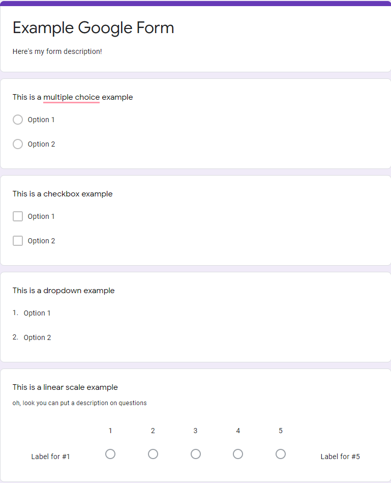
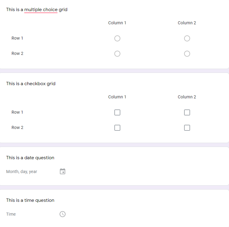
As you can undoubtedly see in these last two examples, this survey platform - and most - should have the very question types we went over in the last subsection. The multiple choice questions involve radio buttons because the answer is meant to be selective, with only one possible option. The survey platform also allows for checkboxes and dropdowns, and one can mix and match question types to get out "linear scale" type questions (also called Likert scales), with radio buttons arranged on a continous scale (1-5 here). Every question and every section of questions can have a "description" or block of text associated with it. Grid (sometimes called matrix) questions are similar to the "scrolling" type questionnaire I showed earlier: rather than having the same radio buttons repeated for each statement (question item), we use the "column" points/labels here to indicate the scale labels (like Very True for Me, Very False for Me). It's common for any kind of textbox based question (here the date & time questions) to have "placeholder" text of some kind to indicate to the survey respondent what is expected of them, particularly if you would like a special type of format.
OK, but what do the options look like for each individual question?
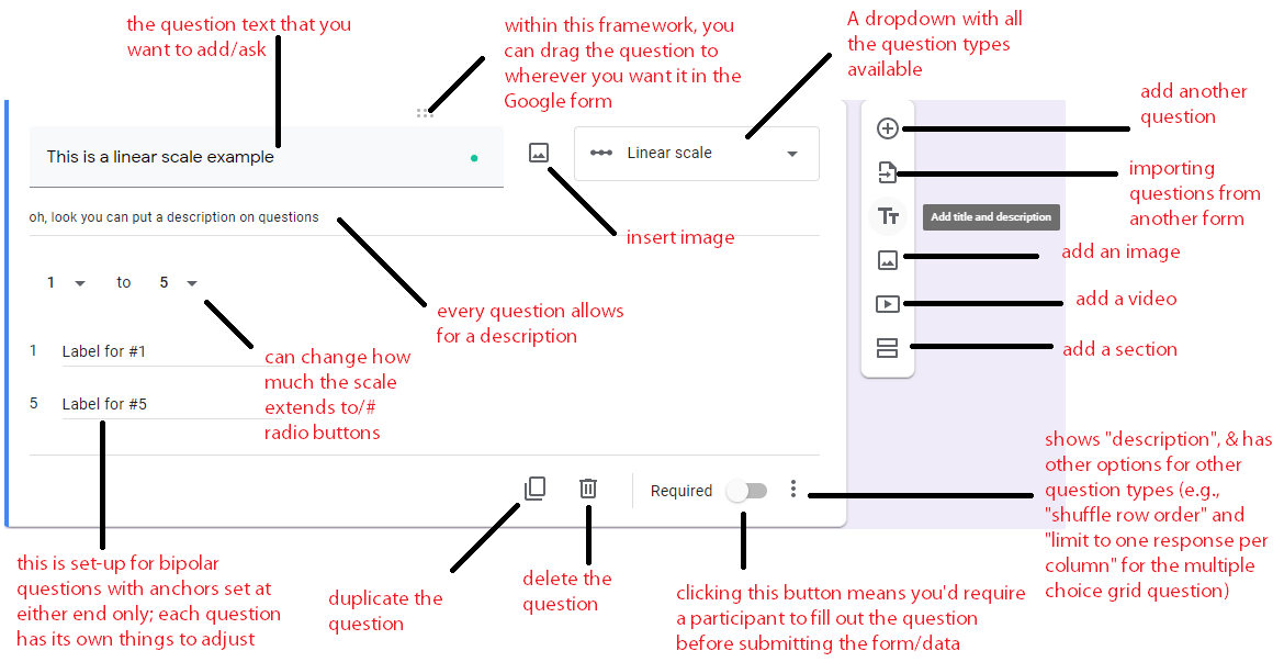
You can see in the question above that each question has a description, allows an image to be inserted, allows a video to be added, and can be deleted or duplicated. Every question on any platform should also have the ability to be "validated": that is, ensuring that the survey respondent has selected an answer. Similarly, each survey platform will have the option to select between different question types - whether that's a dropdown of each question type or a sidebar that includes that information. And finally, each question will have its own description and properties to edit (item text, description, scale points, labels, etc.).
One other thing that I would like to point out here is that if you have a simple survey, like a demographics questionnaire, there is no need to go onto a complicated platform. You can use what you've learned from the first two subsections of this Module and then use the Google Forms examples above rather than making a more complicated version. But if you need something more complicated...
Let's take a look at Qualtrics, which is Duke's chosen survey platform. If you're at Duke, you can easily log on by going to https://duke.qualtrics.com. This should take you to a Shibboleth authentication login page with your Duke netID. Once you are logged in, your page should look something like this, minus the examples that I've included in my particular folder.
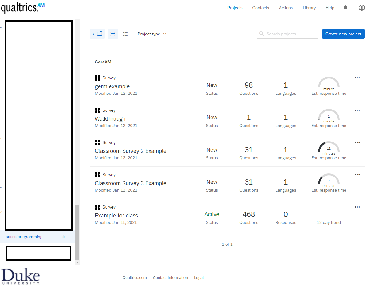
You'll note project folders on the left sidebar (at the top, there is a button to create a new folder). There is a footer indicating this platform is supported by Duke and a navigation bar with "Projects", "Contacts", "Actions", "Library", "Help", a notifications icon, and a profile icon. Of note, it looks like Projects is already highlighted, indicating that this page is the home page once you log in. We'll need to define some terms here.
Projects - Each survey is considered its own project. There are other types of projects that can be created on Qualtrics, but for the purpose of these tutorials, we only look at the "Survey projects" which you can see on my examples - the four leaf-like icon with "Survey" above the title of the project.
Contacts - Contacts are like Excel spreadsheets or comma separated values (.csv) files where you can have columns for name and email, and if you just wanted to send your survey to prespecified folks on a list, this is one way to do it.
Actions - To be honest, I have literally never used this functionality. You can read more about it from Qualtrics.
Library - Within the library, you have a Survey Library, Graphics Library, Files Library, and Messages Library. If there is a type of survey that you use frequently, I believe you can just copy it into your survey library. (You can also copy a survey, generally, outside of this Library functionality). The Graphics library allows you to upload the images you may want to refer to in any survey; e.g., on a survey where I wanted to have participants rate the valence (positive/negative) and arousal (intense/mild) of each image, I uploaded them and then just added the graphics within the survey. I have never used the files library, but I imagine it's something similar, where if you have something you consistently refer to, it's worth uploading. In the Messages Library, I have a lot of "End of Survey" messages that I reuse for studies, changing them slightly depending on the survey and population recruited.
Different survey options (shown when you click the 3 dots icon in the top right of a particular survey) include Editing, Previewing, Translating, & Distributing the survey. These should be relatively straightforward. There is also Data & Analysis and View Reports as well as Project options like Deleting, Renaming, Copying, Closing, and Collaborating. Collaborating means inviting another user to work on the survey with you, and closing the survey means that you've disallowed people from taking the survey (i.e., you're no longer collecting responses). We won't go over the Reports or Analysis components, only we will think about how what you see in the "data" should be at the forefront of your mind when designing as well.
Of note, at any time, if you get confused by Qualtrics's layout, they have a support page that goes over each of these individual components, and I have also linked to individual tutorial pages here. If I get stuck on something, I typically Google search with Qualtrics + the feature I'm puzzling over, and I can often find a corresponding tutorial or related section. The purpose of going over Qualtrics is not to provide even more tutorials on how to use the platform, but on how a "typical" survey platform implements some of the very design and programming principles we discussed above. This is a more complex application of what we saw in the Google Forms.
OK, so now let's take a look at how to create a survey and specifically what sorts of design and programming principles we might see Qualtrics applying. To create a new survey, you'll want to click the blue plus button OR the "create new project" button (on smaller screens, it shows as + and larger screens, it has the description - can you see how this already accomodates different user experiences?). The screen that shows up will look like this:
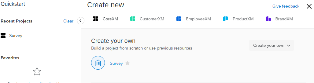
After you click "survey", the screen transitions to:
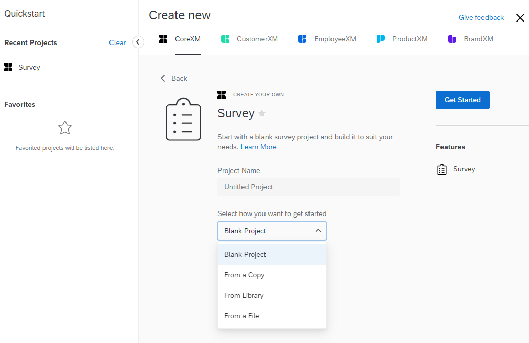
Here's where having a survey library or copying other surveys can come in. Or, where you can upload example surveys ("From a file"). Qualtrics surveys come in the extension .qrf and you can upload those files. Indeed, I've curated a few example surveys for you in the webpage Github if you want to play around with them.
OK, so now we're in the survey. There are multiple new options at the top: Look & Feel, Survey Flow, Survey Options, Tools, Preview, and Publish under the "Survey" tab. Actions, Distributions, Data & Analysis, and Reports were all things that we could have selected before entering this survey. You can see this in the image below:
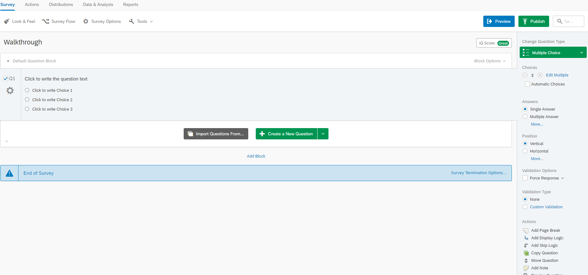
Let's explore some of these tabs. Look & Feel looks like this:
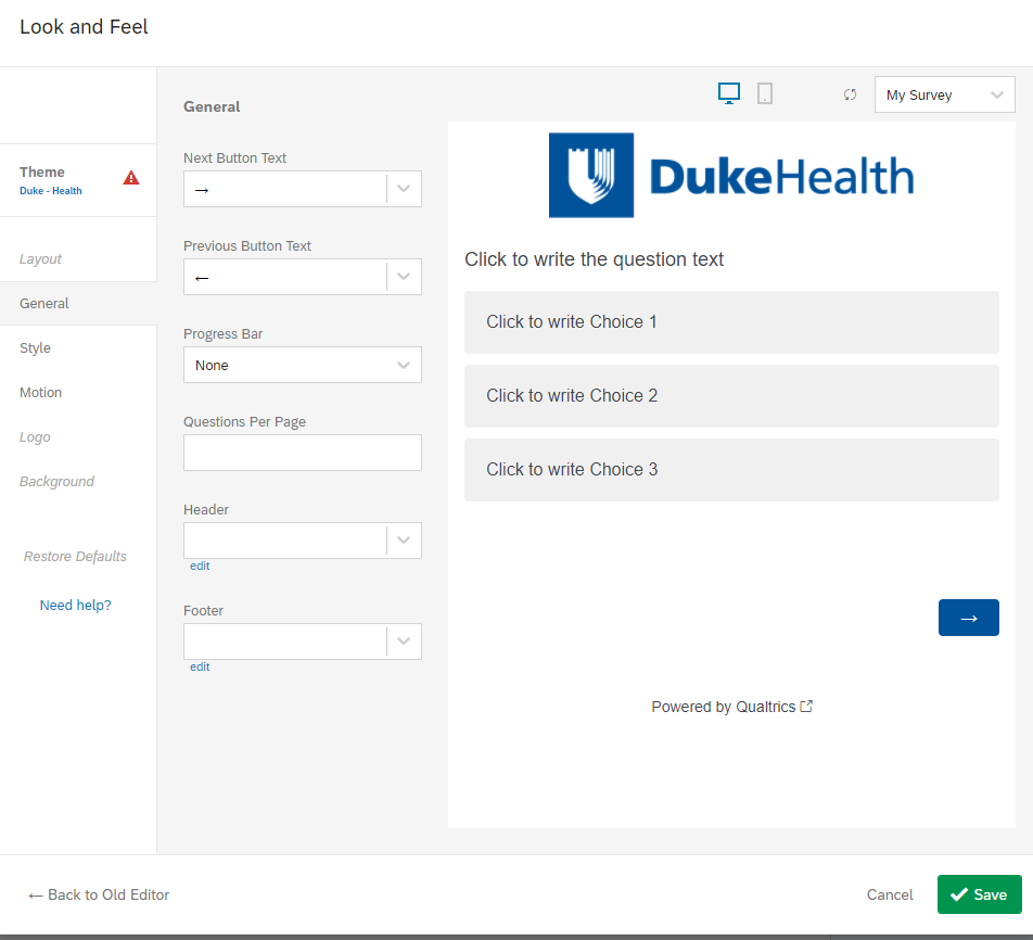
This allows you to make those customized choices we went over on typography, buttons - the "secondary" task elements that will support the "primary" task of completing the survey. And these "general" look & feel components will apply to the entire survey. You could change the arrow button to say "Next" instead of the right arrow. You could add a progress bar. You could change the branding so DukeHealth is not so large. You can set all sorts of larger stylistic guidelines for the entire survey here. In fact, under "Style", you'll see that it asks you about CSS - which is a language that we'll be going over in Module 3.
So, already we've seen an example of how Qualtrics is prioritizing user experience and allowing you to apply the very design principles we discussed above. What about Survey Flow? Well, Survey Flow is kind of boring when you have nothing in your Survey, so let's look at an example survey instead.
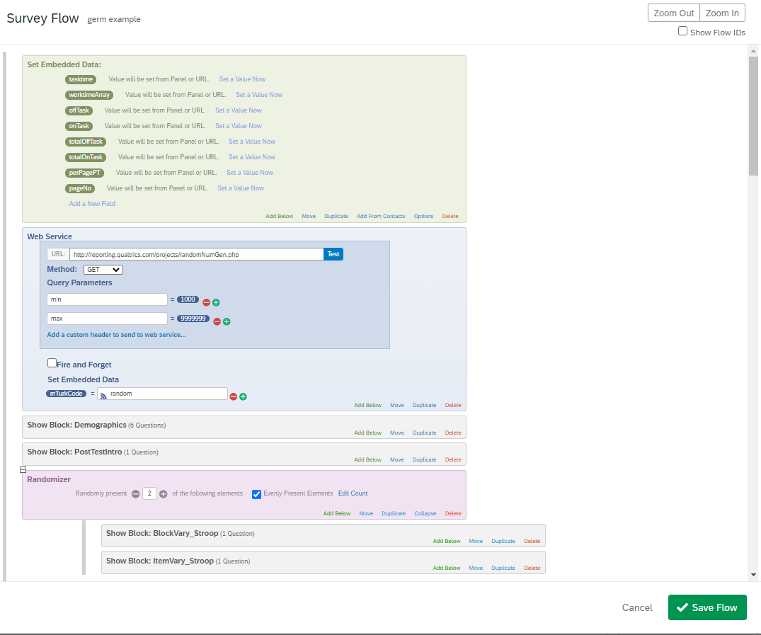
In this example, you've got a little bit of every element within a Qualtrics Survey Flow. Embedded data is the Qualtrics version of a variable whose value can be dynamically updated. The embedded data I have included here (offTask, onTask, etc.) is part of a tutorial on how to track whether someone is paying attention, which we will discuss more thoroughly in Module 4. Below that, I have a reference to a script that generates a random number between 1000 and 999999. I set the variable (embedded data), mTurkCode, to this random number. That means at the end of the survey, I can pipe/show the mTurkCode to participants, and they can input it into the interface on Mturk as proof of survey completion. Below those elements, we have "survey blocks" and below that we have a randomizer for a few survey blocks, meaning that whether the BlockVary_Stroop and ItemVary_Stroop block is presented first will be random across participants. Because I selected "2" of the following elements, and there are 2 survey blocks underneath this randomizer element/component, that means that both will be shown, but which is first is random (i.e., if you had a condition where you only wanted to show one of the blocks per participant, you would put 1 here instead of 2). Because I selected "evenly present elements", that also means that I wouldn't be presenting one of those survey blocks more than the other.
What other elements might you have in a Survey Flow?
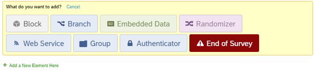
You can have an "End of Survey" element. Typically this is done if you have a pre-screen question. For example, remember in Module 1 how we talked about using pre-screen questions as a means of trying to ensure you have a specific demographic in your questionnaire? Well, you can make it so that if someone is not an undergraduate student (per their response to a question), then you exit them from the survey. This is an example of using a "Branch" element in conjunction with the End of Survey element: If undergraduate after survey block "demographics", then end of survey. You can also have an "Authenticator" element, which is similar to what you experienced when you went to duke.qualtrics.com. It asked you for Shibboleth authentication, verifying that you have a Duke Net ID. If you wanted to ensure that only Duke students did the survey, you could have an authenticator at the start of the survey that would then automatically capture information like net ID, name, etc. for your to access. You can also include a "Group" element to bring together multiple components. For example, in one survey, I had multiple test questions from different textbook chapters, so I grouped together the questions from each chapter. Why would that be helpful? Well, if I wanted to randomly present which chapter went first, I could use the Group in conjunction with the Randomizer element, ensuring that all items from 1 chapter are presented as a block in time, but which one goes first is random.
Now what does this have to do with the design lessons we went over above? We talked about how once you add things like skip logic, you might make more errors. The more complexity, the more variability and the more likely errors will occur. Here's one example. One default of Qualtrics is that when you add a survey block, the survey flow will default to add it exactly where you are in the survey. In one study, a collaborator and I added a set of questions at the end, but didn't realize that this block had then been subsumed under the Randomizer that was used in the previous block. It had, though, and Qualtrics didn't update the "Randomly present 2" of the following elements, so one block wasn't shown. We'd run through the text and preview and hadn't noticed this error. Which is just one example of how when things get more complicated, you're more prone to things like this, and testing your experiment for the User Experience is critical.
Let's take a look at Survey Options (Part 1, Part 2):
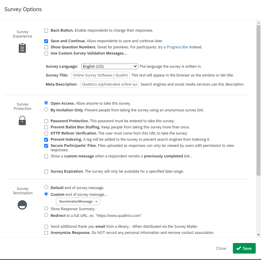
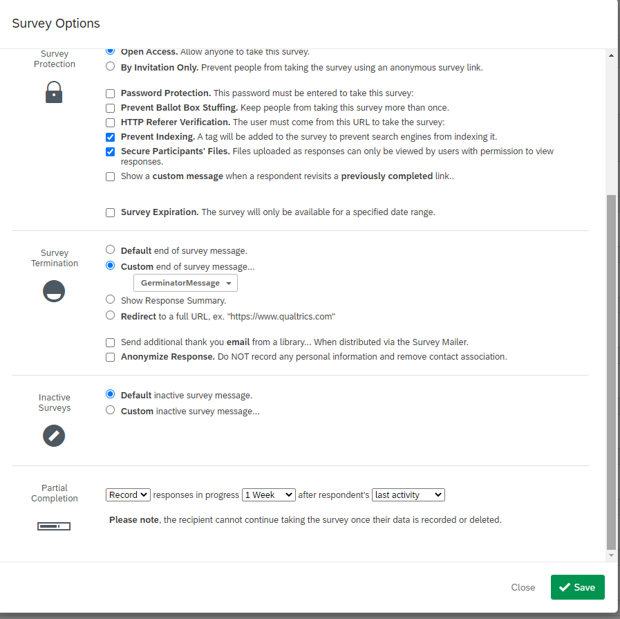
Most of these are self-explanatory, given the descriptions from Qualtrics. You can already see some of the design inflection points that we discussed before: will you allow participants to go back in the survey? Can they save their progress as they go along? How will you be distributing the survey? What will you tell participants upon survey completion? Will you record responses as participants go along?
So, if you remember from our previous discussion on paging vs. scrolling designs, one benefit of paging designs was that it was easier to record data as participants went along in part because there was a button per page, forcing the survey to store the data with the action that was taken (clicking button). That's one big benefit of using a survey platform here. They have in-built databases that can capture data for your various surveys and are fairly good at capturing participant progress real-time in the task. They're not perfect, though - for example, if a participant doesn't "finish" a survey, then Qualtrics won't record their IP address for you.
Let's take a look at Tools:
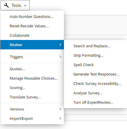
These are basic interactive features within Qualtrics, repeating the idea of translating a survey. To be honest, the only thing on this list of actions from Tools that I have used frequently is Import/Export, where you can import a .qrf (Qualtrics survey file) or export your survey to a .qrf file, or export it to a Word document, or print the survey (e.g., as a PDF document). These are particularly important for version control and open science, providing others with a file that will show your exact question wording and survey flow.
Now, let's take a peek at what it looks like to add a question on Qualtrics.
Okay, so in this first shot, you might immediately notice that when you click the checkbox by the question (or have clicked +Create a New Question), there is a sidebar on the right that gives you a bunch of options related to the question you're asking. If you're using the Create a New Question button, the little down arrow on the right indicates the same dropdown that the "Change Question Type" button dropdown does on the right. "Choices", because the question type is multiple choice, refers to the number of answers that the respondents are presented with. Remember what we talked about with regard to the differences in radio buttons and checkboxes for response options? Well, right below "choices" is "Answers", and changing from "single answer" to "multiple answer" would change the response options from radio buttons to checkboxes, thus changing the question from an exclusive answer to a check-as-many-as-apply sort. Below "Answers" is "Position" - remember discussing design and thinking about the multiple browsers people could use? When you merely click to create a multiple choice question, the default layout is to have the radio buttons be vertical, to prioritize the mobile experience for the question, knowing that the horizontal radio buttons is extremely awkward on smaller screens (requiring a horizontal scrollbar just to read all the options).
Next up are Validation Options, including nothing checked, Force Response, and Request Response. You should almost never use Force Response, especially if your research consent form says participants can skip any question if it makes them feel uncomfortable. Force Response is exactly what it sounds like: the participant cannot move on in the survey without providing a response to that question. Request Response, when a participant tries to move on in the survey without answering a question, will provide a pop-up alert notifying participants that they haven't responded to # of questions, did they still want to move on? Nothing checked just lets the participant move on. I use Request Response for the questions I think are required (because I need these for an analysis) and no validation for questions that are optional (Is there any other feedback you'd like to provide?). I only use Force Response with respect to the consent form in classroom research (where I am not the instructor): in this case, I have generally incorporated surveys as part of the teaching process (for the instructor), and I need to know whether the instructor's students are consenting to let me use their data for research purposes after the semester is over. I also use Force Response when I ask MTurk workers for their worker ID because I quite simply need to know who has done my survey and who should have their HIT approved. Within Qualtrics, you can add other Validation, like "Custom Validation," which means specifying things like the answer to an open text box must be a numerical form or between 1 and 100, etc. I would typically not recommend using these unless your instructions are very, very clear for participants what they need to enter. It's similar to what we discussed earlier about the user experience and making sure that your participants really know what you need them to do. If they don't understand, they could spend a lot of time simply trying to answer correctly merely as deemed by the validation.
Finally, there is the "Actions" section, which allows you to Add a Page Break, Add Display Logic, Add Skip Logic, and Add Note, in addition to just copying or moving the question. Adding a page break directly relates to our discussion on paging versus scrolling designs: if you have three questions in a block, you can insert a page break between them, and then your participants will only see one question per page during the survey. Display logic governs when someone will see a question, while skip logic will choose when not to show a question to a person. As we discussed earlier, the more display/skip logic that you add in, the more complicated your survey, and the more complicated, the more likely there is to be an error somewhere in your logic, so I'd only engage with these options if the extra "skippable" questions added a lot of extra time. And when you add a note in Qualtrics, it is just a comment that you can see in the document - your participant cannot. This makes notes ideal for collaborating with other folks (e.g., marking a change you've made or a question you want a collaborator to answer), and is good for helping you in your version control goals.
Notably, every question is also within a "block," here termed the default question block. You can rename the block and the question, with labels that will make it easier for you to remember what is being asked in that section. Each block will automatically be presented on a new page rather than within a scrolling design, so if you wanted, you could create a new block for every question that you wanted on a new page. One benefit to blocks is what we already saw in the Survey Flow section: you have Blocks as elements. That means that if you wanted to control or randomize the order in which things are presented in a systematic fashion, you might want to have them in separate blocks. Notably, here, there are "Block Options." Within these options are: View Block, View Block in Survey Flow, Collapse Questions, Lock Block, Question Randomization, Loop & Merge (I will discuss Loop & Merge more in the sections below), Next/Previous Button Text, Move Block Up/Down, Add Block Below, Copy Block, Copy Questions to Library, and Delete Block. If you want to make sure there are no more edits to a block, you can lock it, and if you just wanted to randomize the order in which 3 questions appeared in a scrolling design, you could use question randomization here within the block. That means the 3 questions would randomly appear but still be shown on the same page in a scrolling design. Remember when we looked at the Look & Feel of the survey? It offered us the option to change the next and previous buttons for the entire survey. Here, within a block, you can apply any design choices you might want to just that one block.
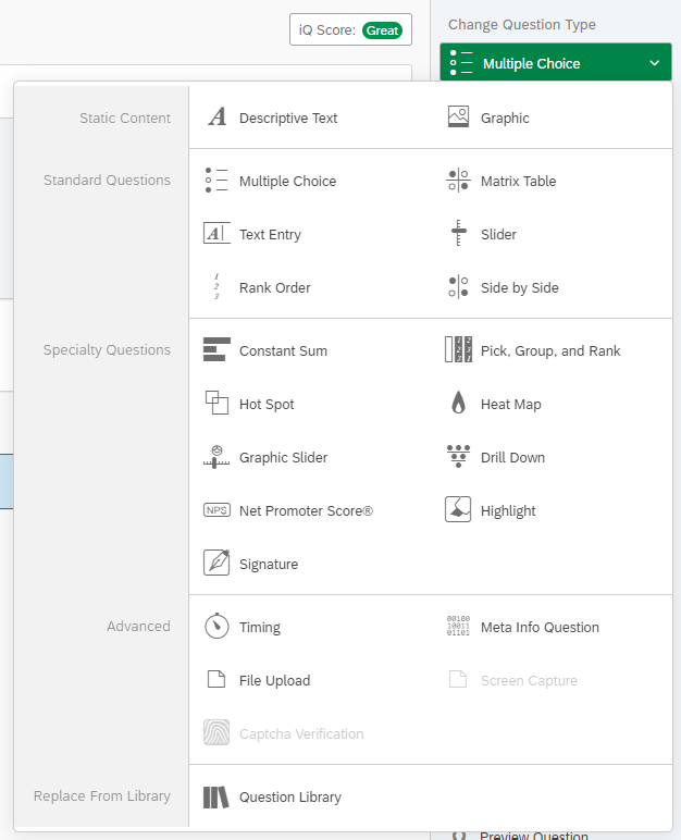
Here, in this second shot, we're looking specifically at the types of questions that Qualtrics offers. "Text Entry" is like the text box vs. text areas that we discussed. The research methods literature we briefly discussed earlier also suggested never using sliders, instead using radio buttons for each option. Matrix table is like the Google Form question that we looked at with multiple rows and multiple questions: these typically pose an issue for mobile users, because resizing multiple columns that are presented horizontally is not ideal, so the browser will create a scrolling bar, and that increases the likelihood that your respondents will not see the options on the farthest columns. Descriptive Text is a good way to include instructions for your participants, and here Qualtrics also allows for Graphics or images to be easily inserted within the survey. Some of these other questions are "specialty questions" that you may never need to use. I have used "Signature" once: for a consent form within classroom research where I was requesting students let me see their grades. You could also use "file upload" for that and have students upload their signatures. The Meta Info relates to the exact broser that people use for your survey and takes no additional time (participants don't have to fill anything out). As we have discussed, browsers can render specialized elements differently (even text/font can look slightly different on different browsers), so it might be worth it to collect that data if you suspect that your survey will look different across browsers. Timing allows for different limits on questions, whether 2 minutes passing before participants can submit their responses or 2 minutes to fill out the questions. Whether or not these are good options for you really depends on what you're asking. For instance, you might want to investigate how participants perform under time pressure, so timing in that case would be a feature of your design; however, if you just want your survey to end by a certain time and impose 2 minute limits on all question blocks, your participants may miss questions and feel rushed.
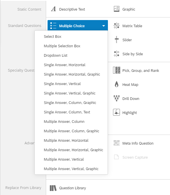
In this third shot, you'll see that each question type also has a number of different dropdown options. Often these are also options that are customizable within the sidebar that we went over in the beginning, just like how here this dropdown has the single/multiple answer question and the horizontal/vertical layout question.
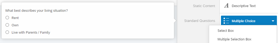
Finally, in this fourth shot, really if you're ever uncertain what one of the proposed questions looks like, Qualtrics will provide you with a popup window and a sample question. So at the end of the day, if you're not certain whether your questions are well-suited for the types that you've chosen, you could also hover to see what the examples are like and see whether yours match.
OK, so now let's discuss how Qualtrics generally complied with the principles of online programming as discussed above.
First, how is Qualtrics prioritizing the user experience in its programming? A lot of the design choices that we talked about are defaults in Qualtrics, as mentioned above. There is also significant styling on Qualtrics's end to make things work better: as noted in the previous example of radio buttons in Subsection 2, you can see how even radio buttons become longer buttons that are much easier to click than a radio button because of their expanded size. The font that they choose for survey links - if you don't edit a survey - is easily readable at a large font size. We could go over multiple examples of how the platform simply makes things easier for participants. I suggest that you play around in Qualtrics to see this for yourself. Qualtrics, as you may note from the first screenshot, also has a feature called "iQ Score" that runs through whether you have programming logic issues and other design issues. This is yet another set of recommendations that you could look at for your survey and yet another way this survey platform applies the very concepts we discussed:
Of course, this iQ score is not an end all, be all. It will not catch all errors or all ill-suited design choices. But it is something worth looking at and considering, or using as a sort of checklist if you program your own survey. For example, it already suggests not using matrix tables given their issues on smaller screens, and it attempts to look through your various programming logic to see if they run. It also tells you to try and make your survey shorter, because longer surveys can have worse completion rates if participants aren't used to taking surveys.
What else from our online programming principles was fulfilled? Well, second, you can organize your projects by creating new folders. This might be one way of version control. You might, for instance, create one larger project folder like "socsciprogramming" (see below) and a subfolder that you drag to "socsciprogramming." You name this subfolder "Module 1." Within "Module 1," you could create more subfolders. If this was an actual experiment, I could do a pre-piloting-RA folder, then a piloting-sub folder, then a experiment-1 folder, indicating two stages of piloting the survey before running it with my population of interest. The copies found within each project folder are then saved to show what sorts of changes you might've made along the way. You can also just mark what changes have been made in the same survey, but more deliberately (scroll down to "Version History" for tutorial).
Running Mturk experiments with Qualtrics
As you already know from Module 1 on MTurk, there are a few things that you will need for running an experiment: a way of linking each participant's response on the survey with their response on the MTurk interface; a way of generating a unique code for each participant to put into MTurk as an indication of having completed the survey; and a link to the survey that can be used for all participants, but that still has your instructions and code and questions.
On the first front, this is the only time I ever use the "Force Response" validation on Qualtrics. I need their worker ID information to link who turns in the HIT on the Mturk interface and their individual responses on the survey. Arguably, the unique code that they are given at the end of the survey could be the "linking" information between the interfaces, but in the past, I have seen examples of times when two separate accounts paste the same code. In such circumstances, without collecting a worker ID, I wouldn't know who actually did the survey and who might be copying the code from somewhere else. Or, whether I should look into the same randomized 8 digit code was provided to two people. So I find it quite useful to "force response" on MTurk worker ID responses.
The next thing to do is to generate a unique code to give to participants at the end of the survey. There are two ways to do this. First, you have the option to use another randomizer php script with the survey flow:
Here, you can see the Web Service element is referencing a URL PHP script at Qualtrics that will generate a random number, with a minimum value of 1000 and a maxium value of 9999999. And whatever number is generated, this is put into the Embedded Data (variable) "mTurkCode". That then can be called upon when participants have gotten to the end of the survey.
The next option comes directly from the MTurk guide to using Qualtrics within their interface, which was informed by the same Qualtrics tutorial.
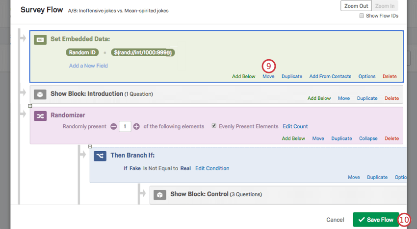
The above image is courtesy of the linked tutorials. There, you basically create an Embedded Data element within the survey flow, create a new variable name within the element, and set its value to a random number integer between the min and max value. It's very similar to the method mentioned above in the fundamentals, but with a slightly different approach.
One of the final components is making sure that you can use the same link to have multiple participants respond. That, we'll cover in the Distribution section. Don't forget to include the consent form in your survey too.
Coding within Qualtrics
One thing you might have noticed earlier is that I didn't go over how to call upon the embedded data (variable) within Qualtrics. I said we'd created this mTurkCode to give back to participants so that they could input a unique identifier into the survey link platform on MTurk. However, I didn't say how you'd call upon these data.
Qualtrics has what's known as "Piped Text." This is their version of saying that you're going to call upon some variable, and within Qualtrics, this usually takes the form of "${e:// ...}". You can call upon any embedded data within the survey, whether that's how a participant responded on a previous question or just calling upon what your previous question was, an embedded element you created within the Survey Flow, or an element that you created and added via the distribution.
You may be wondering: what does this actually look like? In the below example, you'll see what an example of what the 'final' screen looks like before participants on an MTurk survey submit their data. I let them know what their unique survey code is - SOCSCIPROGRAMMING + some random number (generated via the Survey Flow, as we discussed earlier) + 0113. Within Qualtrics surveys, I usually put an identifier like initials at the front and the same numbers at the end so I can skim through the codes and see ones that don't even follow the correct pattern on the MTurk interface.
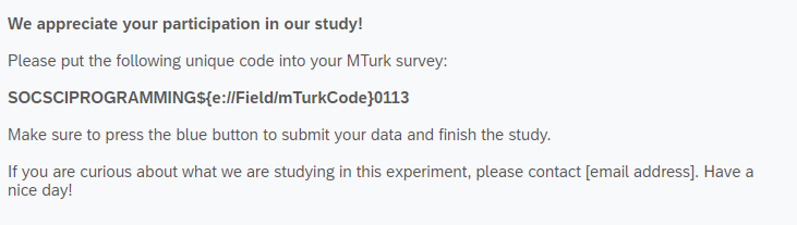
You can also see piped text in action in this next screenshot, where within the same survey, I refer to a) what the participant chose on a particular question, b) what the actual question text said, and c) what the actual response options were for that question. The Piped Text has changed to "${q:// ...}" to indicate that I'm referring to a question (q) and its associated choicfes and the selected response.
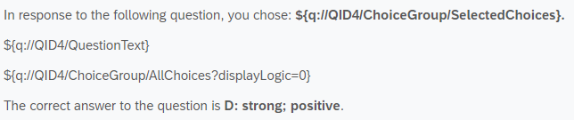
You can even see the effect of piped text by referring to answers from a previous survey. I've typically done this with respect to distributing via email (see section below), creating an embedded data element that has the same name as columns within a comma separated values (.csv) file. This file has contact information and names for particular students and is uploaded as a Contact list that is used for survey distribution. Then the survey has all the information from the previous survey under those columns (simply by matching up the information - like netid/name), and you can refer to these answers with piped text, as shown in Part I and Part II below.
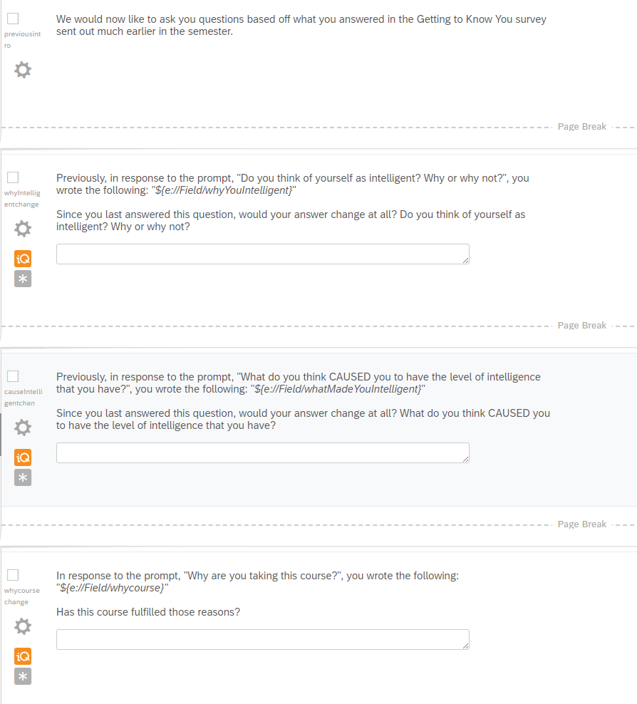
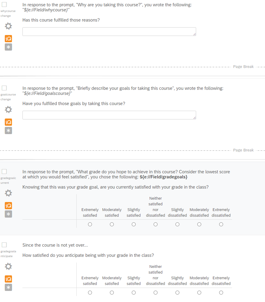
You might notice that in the above examples, the iQ symbol is shown on the left side of the screen. Why do you think these questions weren't ideally designed, given our previous lesson?
You might also wonder how to access Piped Text. Well, when editing a question, you'll see a Piped Text tab, that when you click it, has a number of options for what exactly you're referring. The best way to understand the different fields here would be if you played around in Qualtrics to see what each field does. I've already shown you survey questions and embedded data fields, and the email distribution (section below) will make use of survey links as piped text.
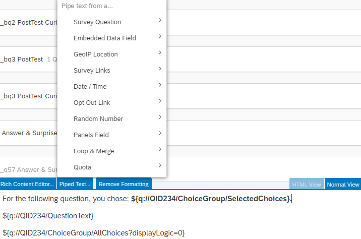
Piped text can also show up within the coding of questions. First, I want you to take a look at the two images below (Part I, Part II).
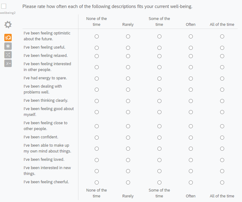
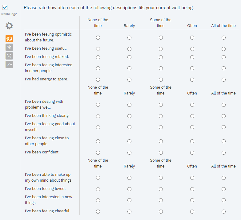
These images demonstrate the problem of using a "matrix-like" (grid-like) design (a version of the scrolling design we discussed), with the multiple columns and multiple rows for a single questionnaire and multiple items within this overarching construct. One immediate question within this format relates to the header for the column. Without the header, if there are enough questions, as participants scroll down, it becomes less clear what each of the radio buttons would mean. If you do use a reminder of the header, which is better: the header at the bottom? The header repeated in the middle? Another issue here is that this is bad for mobile design, which Qualtrics even highlights with the orange "iQ" label on the side. Resizing matrix tables is hard, so on a mobile screen, to make sure that there is space for the labels and the radio buttons, you'll usually end up with a horizontal scrollbar, which can impact your survey in unknown ways (e.g., encouraging participants to just left the leftmost option, because it's the most accessible option). We've gone over some of these survey design issues before.
One alternate to the matrix-like format is to create individual multiple choice questions. This is pretty easy if you have only a few questions. If you have multiple, you might want to use the Qualtrics version of a "for loop", i.e., the Loop & Merge function available under the "Block Options".
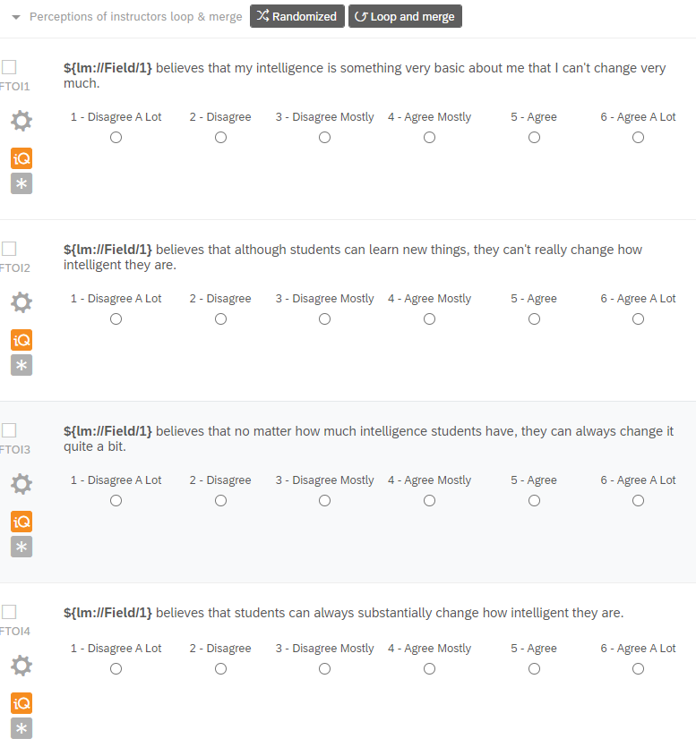
Oh no! The orange iQ button strikes again! What might you change here?
In the above screenshot, you can also see how the Loop & Merge functionality works at a basic level: it is like calling on the piped text functionality, but with preloaded fields for "${lm:// ... }" - that is, instead of the usual "e" to indicate embedded data, this code looks within the "lm" or loop and merge block for what it will input into those fields. (You may also note that in this example, the block is randomized so that the order in which these four questions are presented is random).
In the below screenshot, you can see the exact fields that are input into the Loop & Merge functionality. That is, based on responses to a previous question asking students to choose an instructor who is most responsible for their success in the course, the students are then asked what they believe this instructor thinks about their intelligence. "Field 1" is whatever the "selected choice" was from that question, and because that question involved a checkbox - which, if you remember, is not an exclusive choice - this loop and merge block could repeat more than once. It would repeat for anyone who is selected: Dr. A, Dr. B, etc. Notably, which selected response is shown first is randomized, with the checkbox to randomize loop order selected.
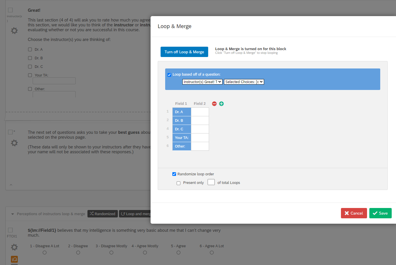
Loop & Merge doesn't just work with previous questions; it also works with multiple stimulus question items. In the below screenshot, you can see in the background that there is a sort of bold paragraph text instruction to participants to respond, thinking of symptomatology over the past year. Then there is a question text that says "${lm://Field/1}" with multiple choice radio buttons. Here in the actual Loop & Merge, you can see that I've listed all the stimulus items that are going to have the same response items, and these will be inserted into the place where I've called upon the Loop & Merge. Additionally, what is not shown here is that I've clicked the checkbox to randomize loop order, so it'll randomly insert the items (order-wise) for participants.
How does Loop & Merge fit with our previous discussion on design as well? Well, this functionality will depend on how you use it. In the last example, I would only be showing one question per page, but in the previous example with the instructor, I'm inserting in the instructor selected choice for four questions of a questionnaire on the same page. It essentially has the design that you make of it when you call upon it, only being constrained with respect to the block level element in Qualtrics.
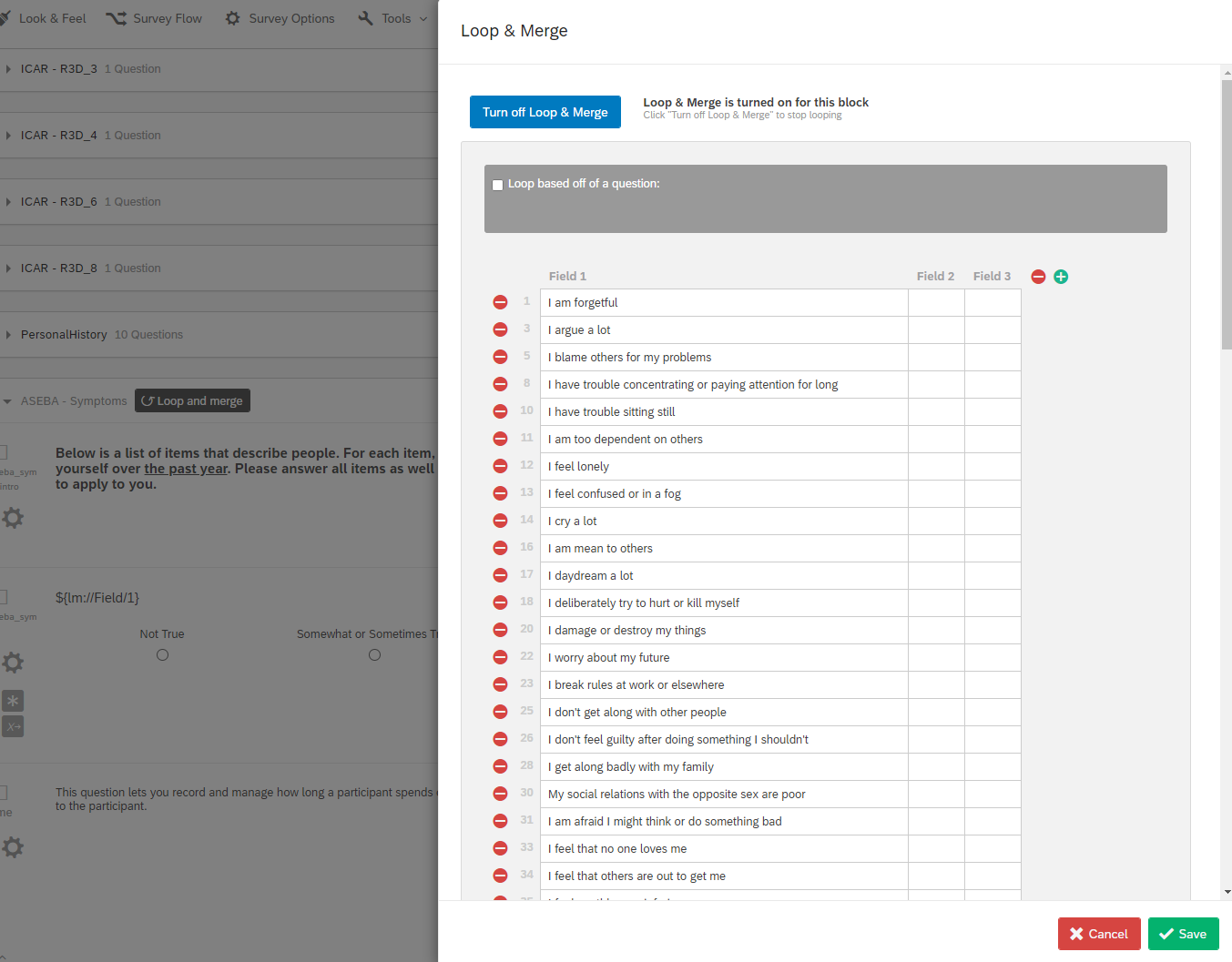
Now, usually you can click the "preview" button within Qualtrics to get a sense of what your survey looks like as you go along, but for some reason, Preview does not work very well with the Loop & Merge functionality, so you'll want to test out the survey with the anonymous link option as I mentioned earlier, especially when thinking about the principles of online programming.
Note that we've also already gone over some examples of coding within Qualtrics: whether that's including a between-participants condition (i.e., one group of participants experiences only the X set of questions while the other group or groups experiences the Y set of questions, etc.) via the Survey Flow, or adding in randomization via blocks or changing design with the sidebar and page breaks, etc. Of note, some of these functions don't work as well in tandem - that is, randomizing the questions at the block level works best when there's not a page break element; if so, it may not work as you expect. If you're ever uncertain whether your randomization isn't working, you should always preview the survey or take it using the anonymous distribution link (see section below).
There are a few more important things of note with respect to code. For instance, you can actually recode your answers so that, e.g., 1 indicates the right answer and 0 is the wrong answer. You can see this in the example below, where we've clicked the "cog icon" indicating the settings for an individual question. After clicking "recode values", we're then shown the next screen, which presented all the answers to the question (which I blocked out) and input fields to their left. Here I've thus indicated that answer "D" would be correct.
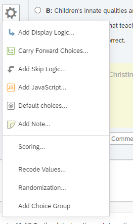
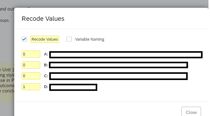
To extract the recoded answers, you would want to export the data. You'd do this by either clicking the three dots on the survey (i.e., the interface when you open Qualtrics, your home screen) and going to Data & Analysis" or doing so within the Survey itself.
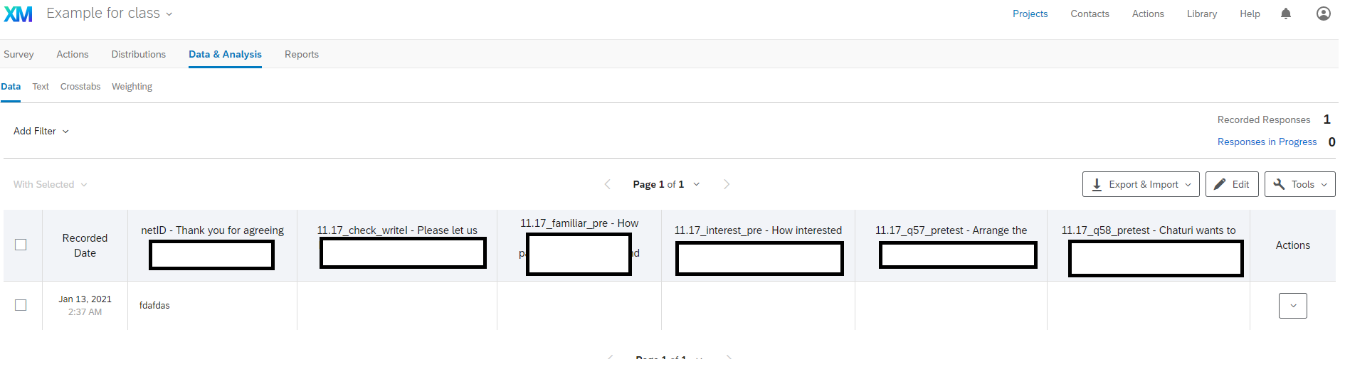
Here you'd then click "Export & Import" and then click "Export Data" to get to this next screen.
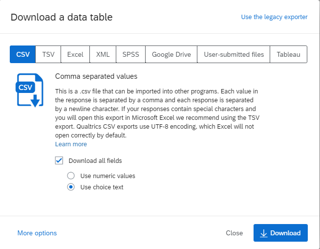
You can then export to a number of formats. I typically use .csv files in my analysis, but your mileage may vary. If you're looking to download your recoded answers, you will want to click the 'use numeric values' option (if you've recoded to 1s and 0s, for example). If you've recoded the responses to text, then use 'use choice text.' I typically use a combination of the two, with text for my demographics questions and recoded numbers for various test-like answers. The other important thing here, especially if you've added in randomization sequences within your Survey Flow, is to click "More Options."
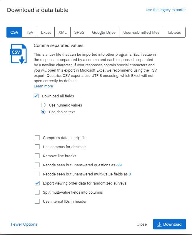
You'd want to check "Export viewing order data for randomized surveys" here. Qualtrics will create an entire column for different questions where you've randomized the order, and in theory you can add this to your analysis, investigating whether the exact order in which things were presented had any effect. It's not organized in a manner that is particularly conducive for analysis, but you can retrieve this information here.
It is generally good practice when coding, whether a survey in Qualtrics or your own experiment with HTML/JavaScript/CSS, to make sure that the data aligns with what you expected, given your code, and that this output can be cleaned and analyzed properly. This is a part of version control from our online programming principles - editing your survey and testing out the UX until you get it both from the perspective of respondent/audience and from your own analytic perspective for ideal data management. Of note, we will actually return to the "settings" option on each individual question (the cog-like icon on the left of each question) within Module 3, particularly with respect to its JavaScript option. Along that line, most of the people I know who use Qualtrics on a regular basis have told me that Qualtrics is not particularly good at collecting response times very well, so if that's your goal, that might be yet another reason to tune into Module 3 and consider taking more control over your survey.
Distribution within Qualtrics
How exactly you distribute the Qualtrics survey will depend on what your goal is. If you've just got an MTurk survey code project online, as we assume from Module 1, let's take a look again at the Qualtrics interface.
You see the three dots at the right? When you click them, one of the options is to Distribute the survey. When you go to the Distribute Survey section, if you haven't already clicked to "Publish" your survey, this is what the screen looks like:
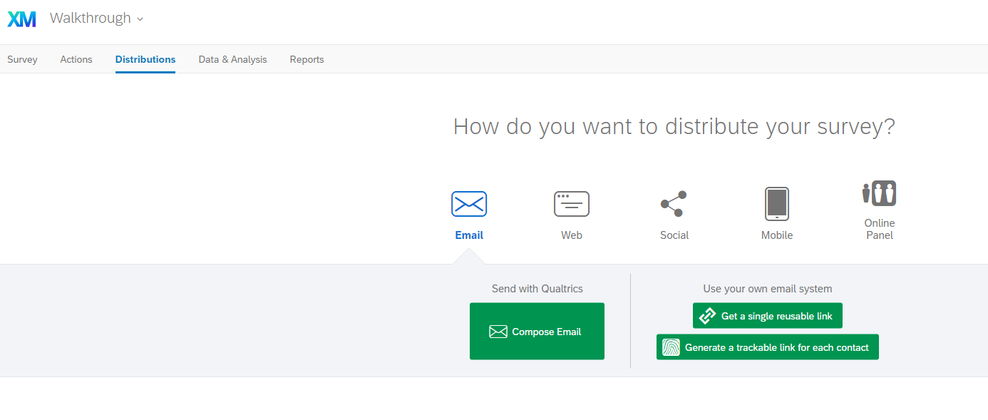
You can also get to this screen by clicking the Distributions tab by the Survey tab within the survey editor. You can see this within the survey editor for one which I've already clicked to "Publish" the survey.
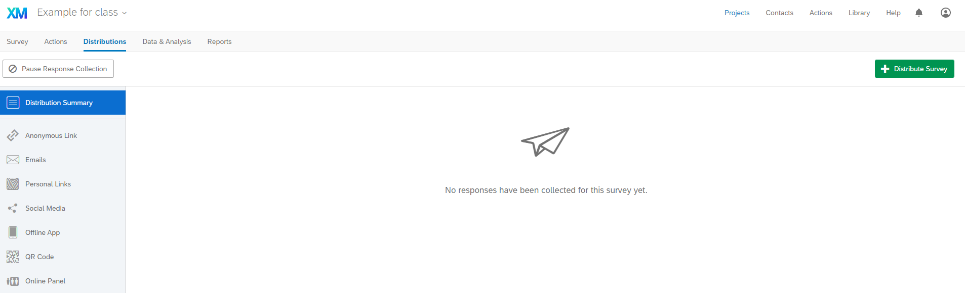
The option for "Anonymous Link" and "Get a single reusable link" is how to link to the survey. The link that is provided is what you put in the MTurk Interface (for the Survey Link projects), and you can regulate the options for the link in the Survey Options (Part 1, Part 2).
For instance, the "survey protection" section has a number of options related to the anonymous link and survey distribution, such as where exactly people are coming from when they click the link, etc. I wouldn't recommend changing any of these, but you can if you want. I often take the anonymous link myself or send it to other people who I want to test my survey, too, because it gives you the direct experience that your participants would have. (Remember our principle of testing for the User Experience before running your study?). This is in particular what I was recommending you test for things like Loop & Merge, where the "preview" button that is right next to the "publish" survey button will not work as you might expect.
Another distribution method that might be of interest to you is through email. For instance, in classroom research, I've used the email distribution method, because students are accustomed to emails from their professors, and fitting in with established expectations can help facilitate the user/respondent experience and make filling out my survey easier. To use the email distribution method, you may want to take advantage of the Contacts tab we discussed earlier.
This is what my Contacts tab looks like. You can see that I've "created contact list" a number of times - all with a varying number of members.
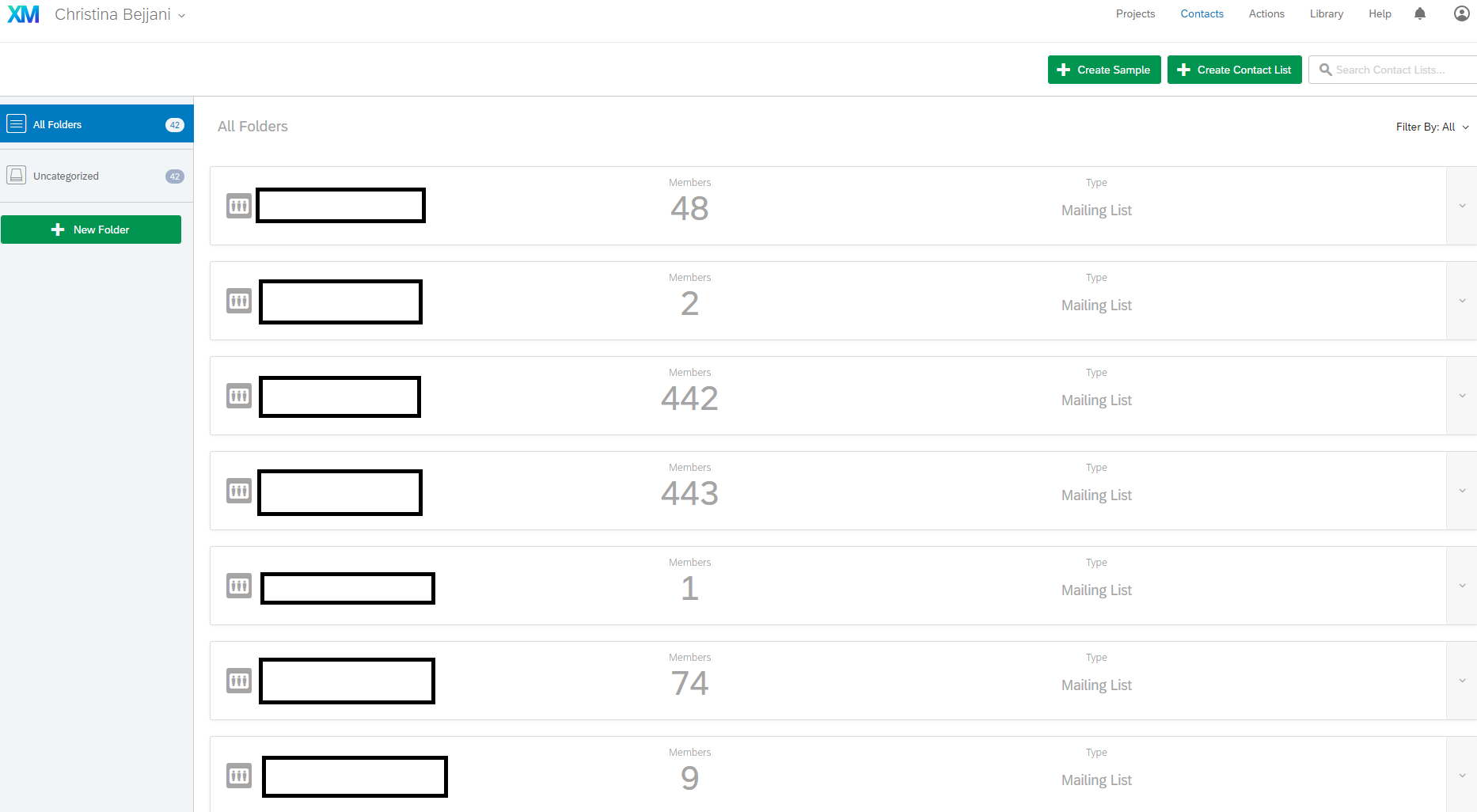
If you go to create a contact list, it will ask you for a name and folder under which to put the list. For this example, I put something like "test" and many of my contact lists are not organized here in these screenshots (i.e., I didn't list a folder). Next, you'll see this screen. Essentially, here you're either manually entering the information for your list or just importing in a class roster or other .csv (comma separated values) file. What Qualtrics will need to "add contacts" in this step is a field that says "Email" (as noted in the "File Requirements" section). That just means the column name.
Ok, so let's say that you've created a contact list by now. The next step is to then go back to Distribution and go to emails. To click, Compose email.
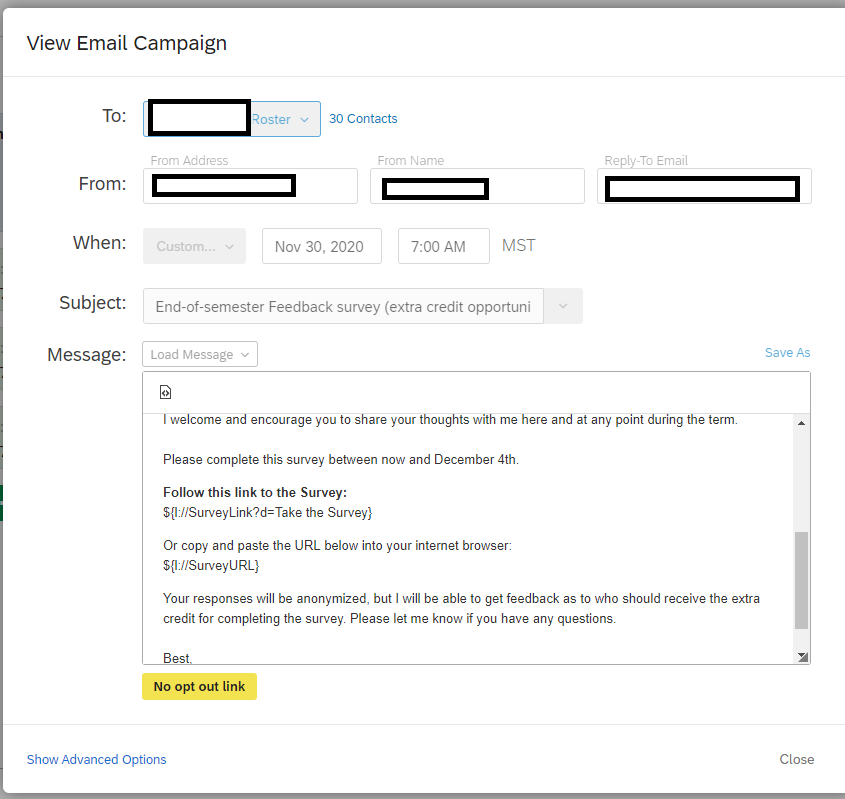
I clicked the dropdown to send the email to an already uploaded Contact List - here someone's roster - and it confirms the number of email addresses (30 folks). I change the contact information and timing according to the goals of my survey, as well as the general framing.
As you can see from this example (and the rest of the email below), this email is similar to what we went over design-wise, in thinking about distribution. It describes the incentive for the survey, how long the survey takes, what the purpose is of the survey, and includes a link to the survey as well as the signature from the instructor. Unlike what we discussed earlier, this doesn't include a personal address to each individual student, but note that even here, we are using Piped Text, because with this distribution method, that piped text will provide a unique survey link for each person on that contact list. In this example, since this is old and this email already went through, I'm merely viewing the email, but if this were an active survey, the "close" button would say "preview" and "schedule" with respect to the email.
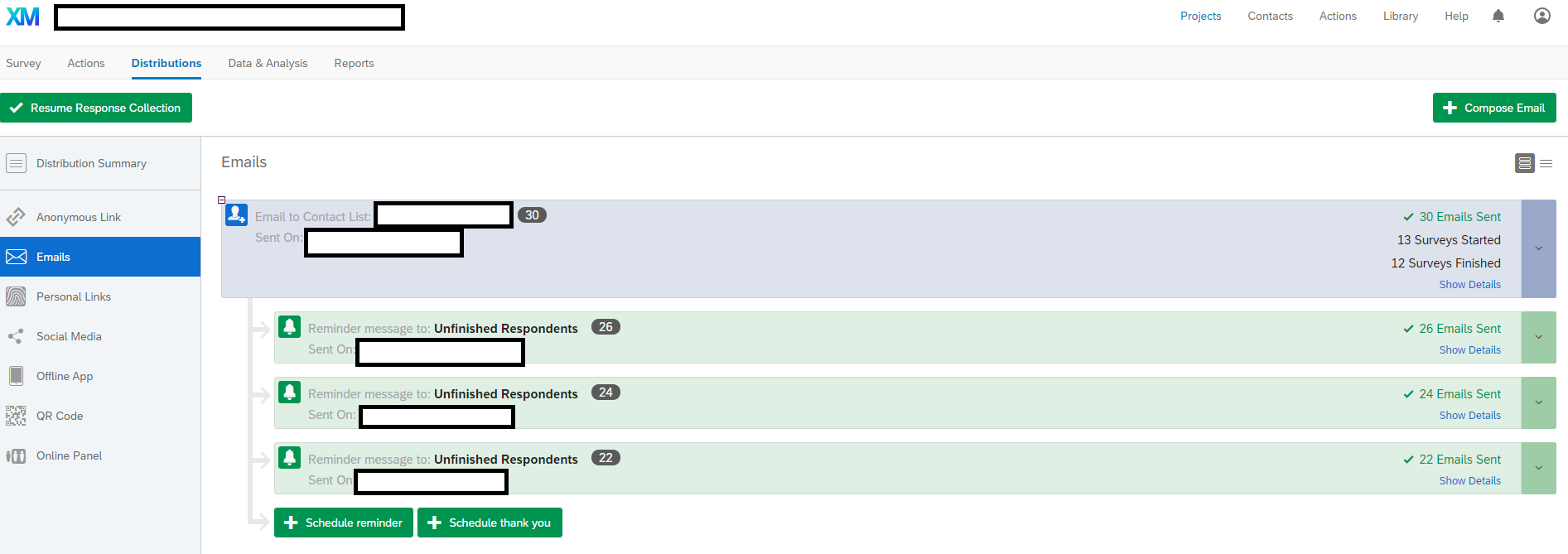
And, once you've clicked to "schedule email", you can even schedule reminders as shown in the above screenshot. Because of the piped text providing links to each person on the contact list, Qualtrics can then keep track of everyone who has already done the survey (which links resulted in completion), and can then make the reminders targeted to only participants who haven't finished the survey yet. I usually only schedule 2-3 reminders, and here I scheduled a lot because as you can see, there was a big drop-off in the # of students and those who actually finished this survey (yay data collection during COVID-19!).
Finally, have I gone over everything there is to know about Qualtrics? No. Definitely not. I've meant to use Qualtrics as an example for the design principles that we went over before, but if you're interested in using Qualtrics for your surveys, you can play around in the program, look at the examples in the Github repository, and Google anything you can't figure out (which will probably take you to the Qualtrics site/forum). If you can't find an answer on their tutorial site and forums, because Duke pays for us to use Qualtrics, you can also email the support team for help.
Applied Exercises
Identify the advantages and disadvantages of coding surveys like this Likert survey versus using the Loop & Merge function within Qualtrics for the same questions, applying what you learned about survey design and online programming principles.
What is wrong with the following question? What would you do differently?
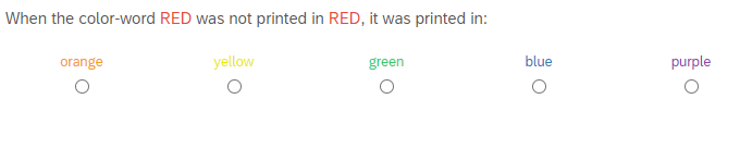
Review the library of example surveys and see what you like and do not. You can import in these .qsf files by creating a survey, but instead of making a "blank file", choosing to create "from a file" and clicking a .qsf file as your start. You can use the Github examples, or the ones that Qualtrics already offers as examples.
Please remember to evaluate the subsection with the Google Form below so this can be improved in the future (you can find the results from the Google Form here).
Test Yourself:
Continue Learning:
- Create a basic Qualtrics survey that assesses some demographics for participants and loops through several stimulus items rated on scales; ideally something that you will use in your own experiment, like a post-experiment assessment or simple demographics survey.
- Set up Git & Github or some form of version control for your coding (whether that includes new folders)
- Set up a public domain site where you will be able to host your task, especially if you continue into Module 3